Velo

Introduction.
Velo is a luxury cyclist e-commerce website. The business needs help enhancing their browsing and checkout experience. Currently, 50% of users open on average 7 item pages and then abandon the site without moving any items into the cart. Additionally, 70% of users who place an item in the cart do not follow through with the purchase. Data shows that users abandon the cart at the registration page since users must make an account to purchase.

I set out to improve the conversion from browse to checkout completion as well as to improve the product's mobile-web experience to bolster the business's revenue. This was done by enhancing, yet simplifying the browsing portals and creating a guest checkout process.
This was a solo capstone project created for Springboard, and needed to be completed within a 90 hour deadline.
Role Tools Timeline
Product Designer Figma 03/01/21- 04/05/21
Product Strategy Miro
User Research Adobe Indesign
Visual Design Adobe Illustrator
Prototyping & Testing
Research.
The target user, leading competitors, and brand identity were all provided by the Product Manager.
Target User
24 - 38 years old
User base is 72% men
High income earners
User takes biking very seriously. They will spend a lot of money on this investment, so they are very picky and do their research.
Industry Leader Study.
Browsing:
For further research I reviewed websites of brands who sell bicycles or are within the luxury sports market, such as Amazon, Target, Trek Bikes, Ralph Lauren Polo Sport, and Rapha.
All e-commerce sites provide a digital catalog for customers to sort through. But what do luxury brands do on their website to differentiate themselves? How do luxury brands show the value of their products in an elevated way?
They tend to maximize on images and brand identity vs affordable websites such as Amazon.
Imaging and brand identity is what I saw missing from most bicycle shop competitors, and what I think would make browsing Velo’s inventory much more interesting for users. The information also needs to be displayed in such a way that users get to specific content quickly, since studies show customers abandon the site after 7 pages.
Amazon, Target, and Trek Bikes Analysis:
Guest Checkout:
At the same time, I researched guest checkout experiences within these luxury brands. There were two techniques I saw that were very productive among competitors.
1) The first was providing a traditional sign in portal, with a guest checkout button that you can click after email submission. This then leads you through the typical checkout process.
2) The second was a direct checkout process with an option to sign in/ create an account for a faster checkout process.
An A/B test will be conducted during the usability testing phase to see which method is preferred by customers.
Rapha Guest Checkout
Ralph Lauren Guest Checkout
Velo Brand Identity.
Bicycle Brand Personality: An expert in the field who is always knowledgeable about the very latest trends and best products related to biking.
Brand Attributes: ○ Savvy ○ Focused ○ Serious ○ Dependable
Similar to how Ralph Lauren created an elite aesthetic around the sport of Polo, this new bike brand represents luxurious class and style. The idea for this bike website is to be the “Apple” of bicycles.
Amazon and other low cost outlets already exist, as well as sports like brands such as Trek Bikes. The market, however, does not have a luxury brand when it comes to bicycles. They do with motorcycles, as seen in some inspiration examples, but not classic cycling.
After researching cyclist terminology, I decided to name the brand: Velo. It’s the french term for bicycle, and who better to define luxury than the French? They also host one of the most iconic Bike competitions around the world: Le Tour de France.
What’s interesting about the word Velo, is that if you manipulate the letters around, you can create an image of a bike, which ultimately became the logo.
User Flow.
After solidifying the Velo brand and analyzing competitors, I created a few user flows to preview which features were important within the browsing portal and checkout process. Two checkout processes were created to enhance the A/B Guest Checkout test later on.
Ideating.
Low Fidelity Mockups: Sketches
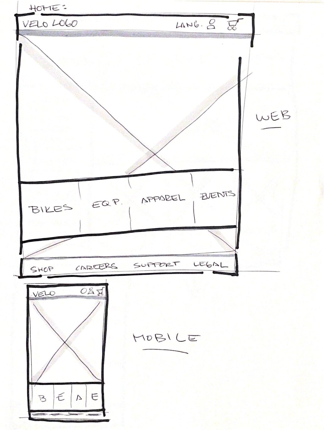
I started very casually sketching ideas within my notebook, allowing me to be messy and explore layout options. I began experimenting with the placement of the navigation bar throughout the different screens. I knew I wanted photography to be the main focus of the page, so these sketches helped me brainstorm different methods to organize inventory and selection features.
For responsive design purposes, I also tested how the website layout could translate to a mobile screen to be versatile.


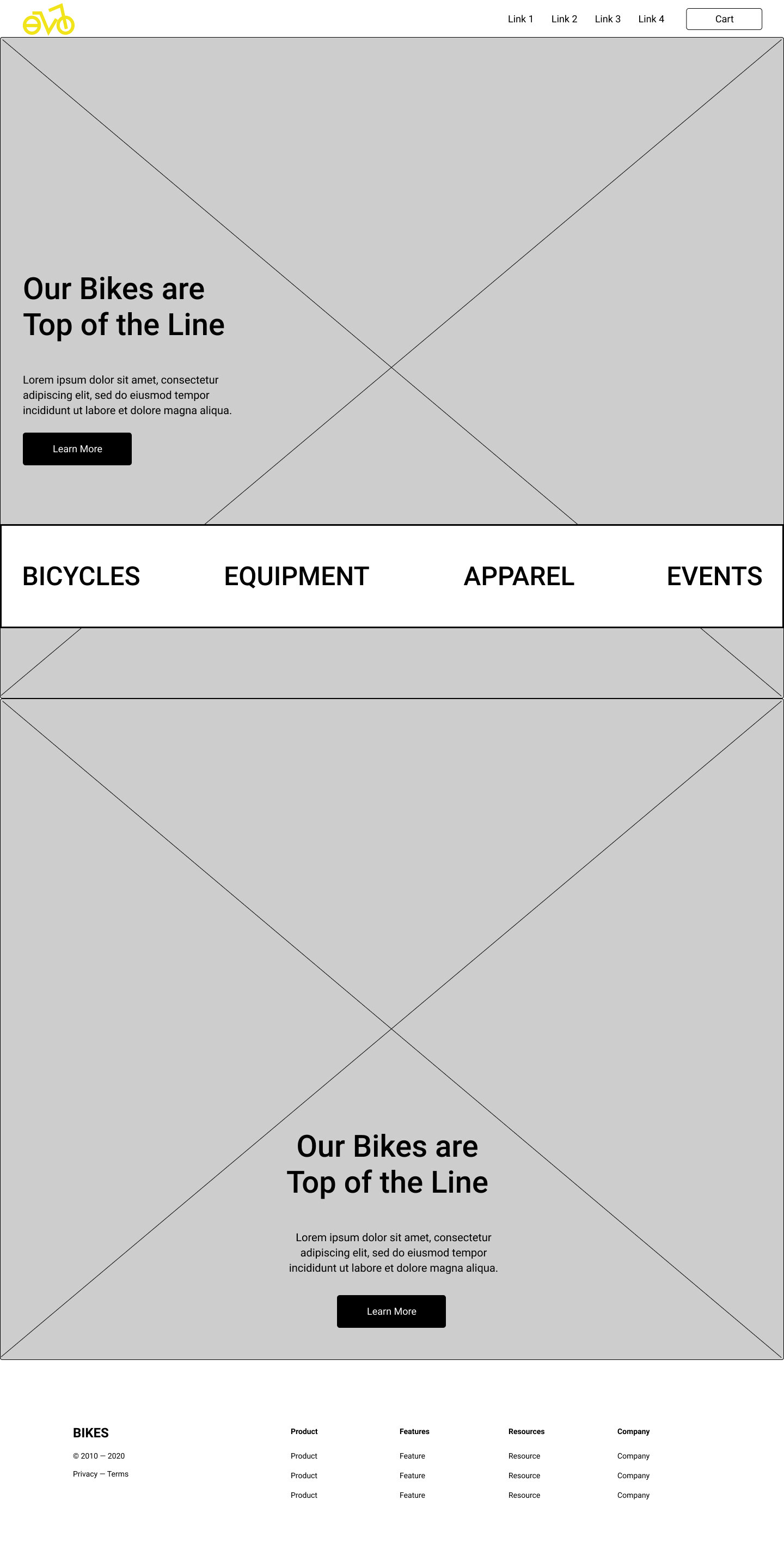
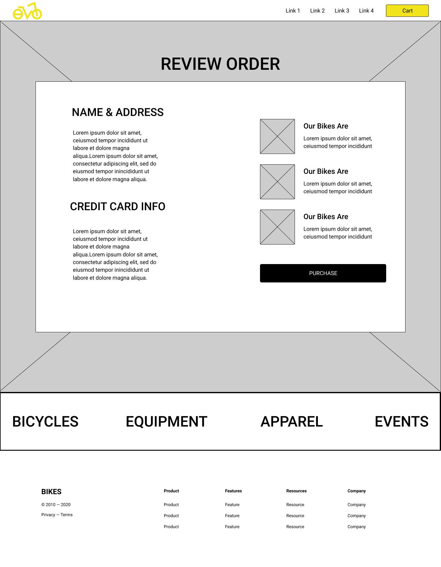
Mid Fidelity Mockups: Wireframes
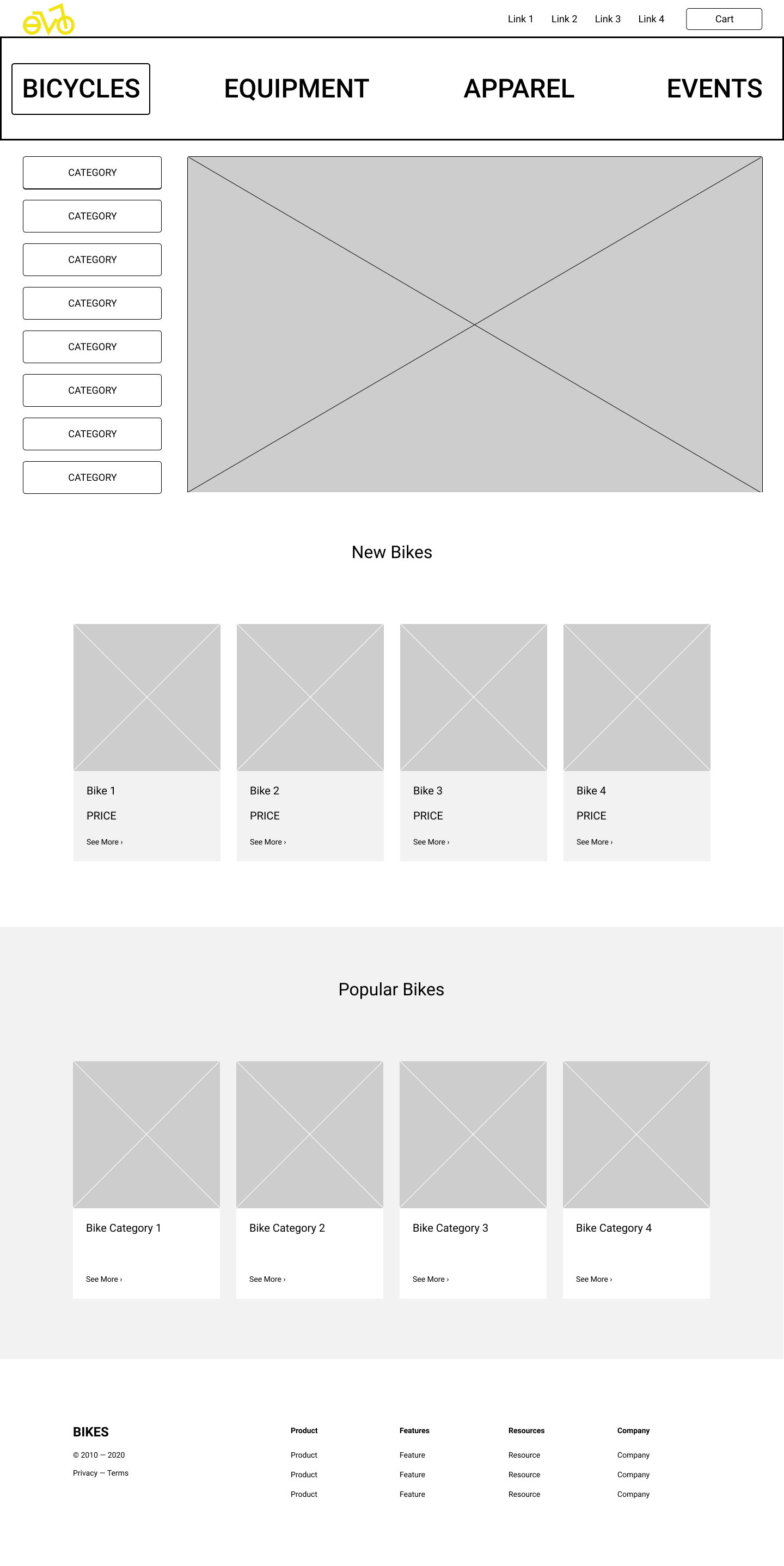
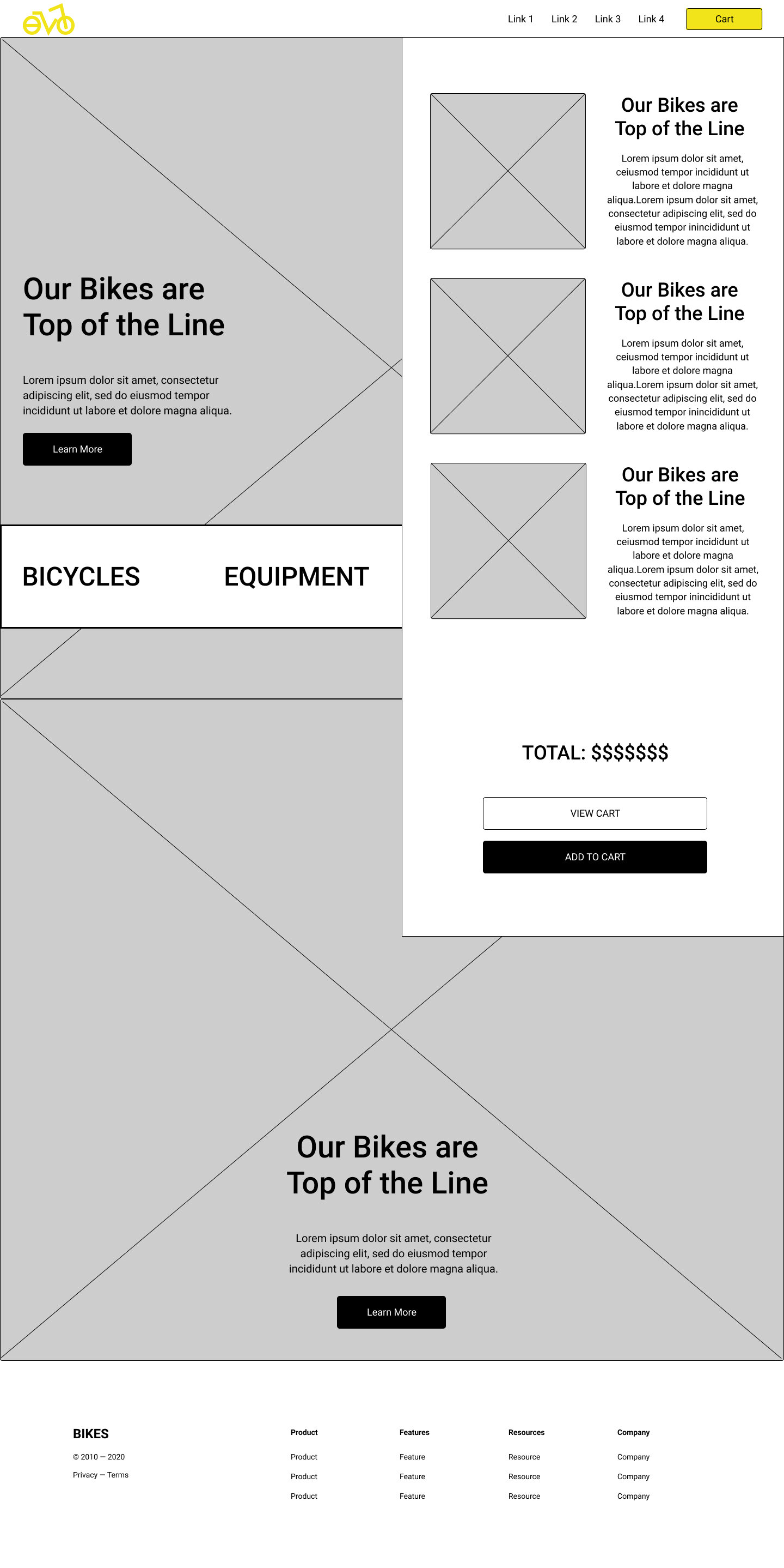
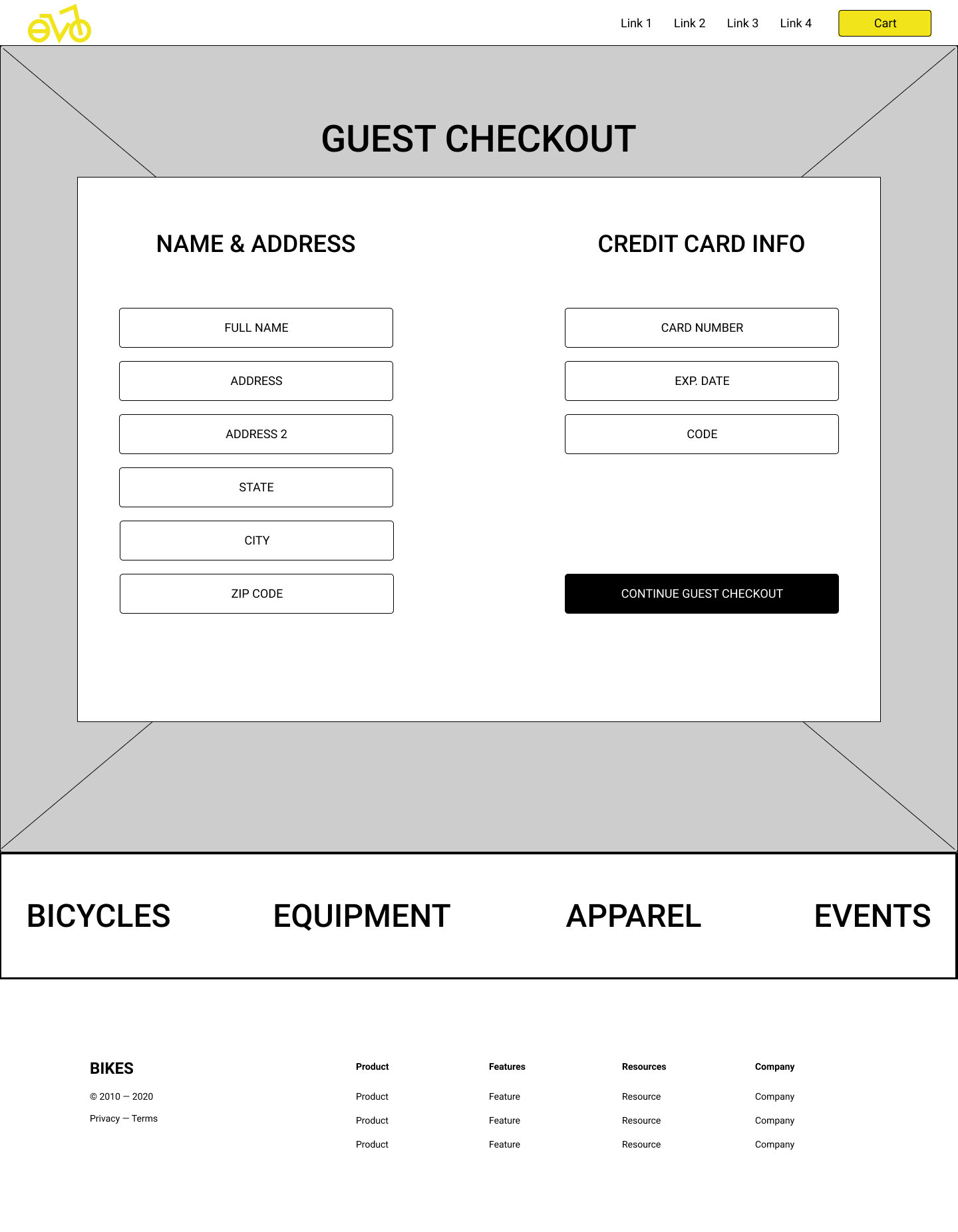
From there I created wireframes to get a better understanding of how headers and text blocks could stand out against the photography images. I again tinkered with the idea of having the navigation bar move around the site depending the page as a design element.


Prototype: First Iteration.
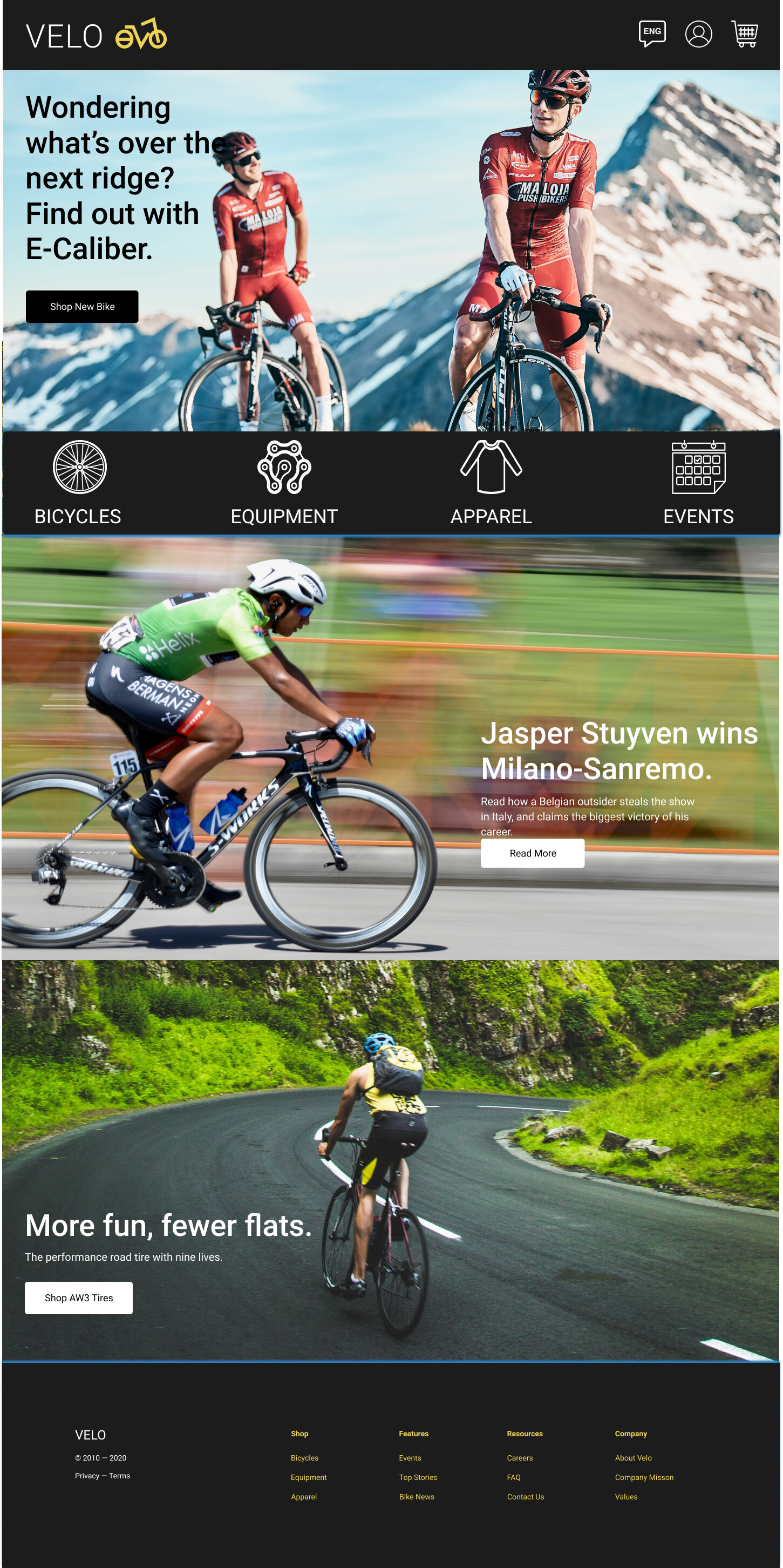
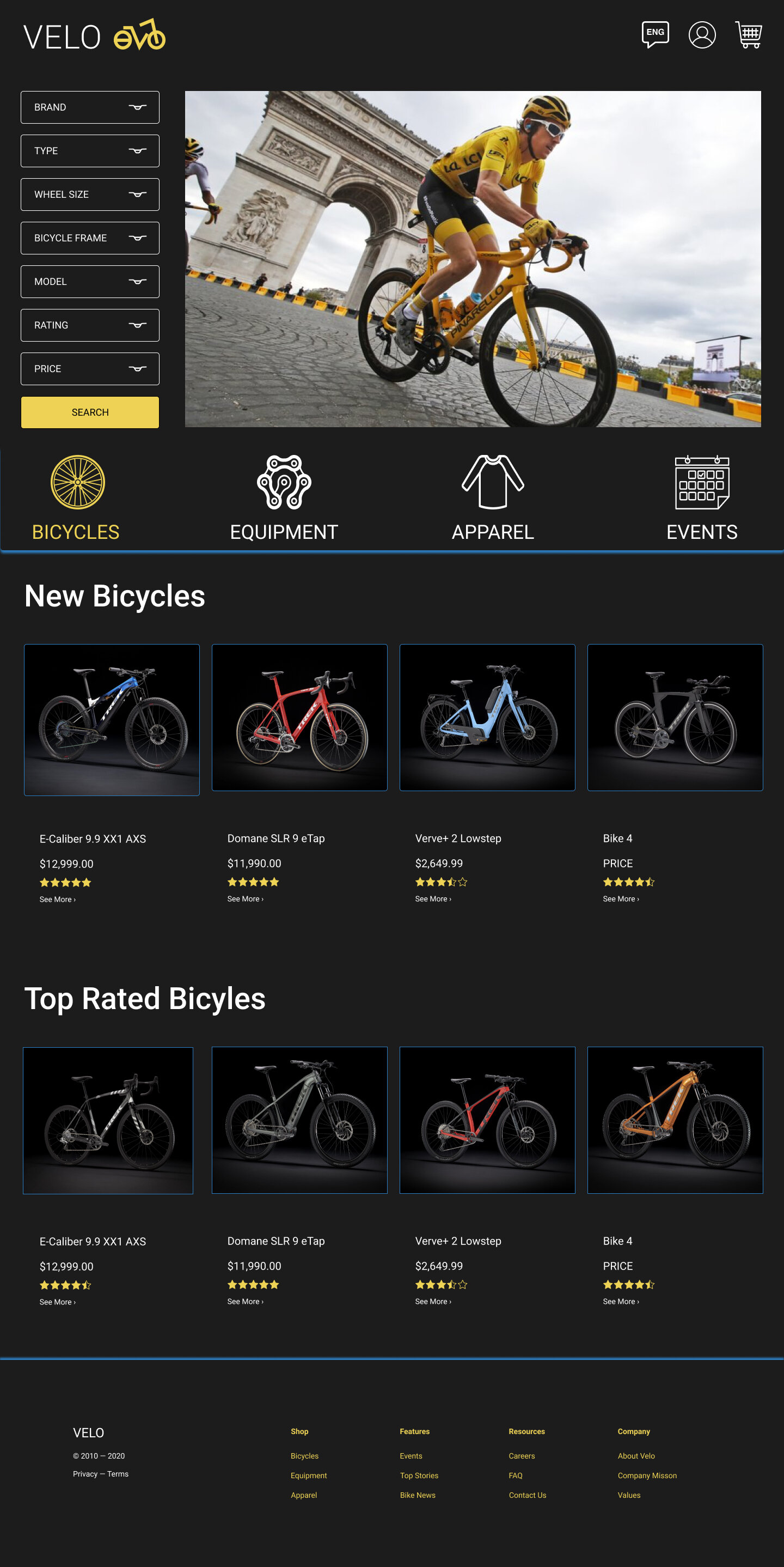
I then added color, photography, and icons to the wireframes.
When deciding colors, I wanted the brand to appear timeless. I found several black and white cycling photos to inspire me and decided a dark background and foreground would look best in contrast to the bright images. When looking through images in color, yellow cyclists always stood out from the pack, and that when I knew that would be the main color of the logo.
Secondary Colors were inspired by France’s flag colors, blue and red, cohesively tying in the brand’s roots into its overall design.

Usability Testing: Round 1.
Once the first iteration of the prototype was completed, I administered a usability test via a remote virtual hangout to 5 people. The users fit the description of the brand’s target user (majority men, aged 24-38, interested in cycling). I asked users to test the Velo website via their own laptops. I was the facilitator, and provided instruction if needed. I also took notes and observed the session.
The three main issues were: Users had a hard time understanding where to click to further explore from the home page. They also had a difficult time understanding how to browse the inventory, since the navigation bar was not up top and easy to find. A similar issue happened with the Bicycle browsing page. The large images were missing navigational texts to lead the user’s eyes to scroll further down the screen.
A/B Testing:
Guest Checkout.
The second part of the Usability Test incorporated image comparisons.
I asked all 5 users to review and go through the process of completing Guest Checkout A and Guest Checkout B.
Guest Checkout Option A: Opening Page
Guest Checkout Option B: Opening Page
Option A is a more traditional Checkout process with a sign in portal for members, and then adjacent to it a guest checkout portal before presenting additional areas to input information.
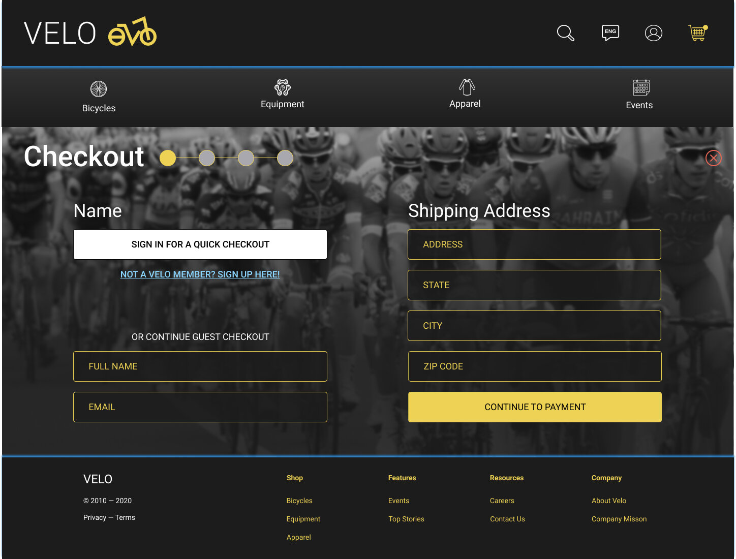
Option B opens with areas to input information such as your address and payment information. There is also an optional button where users can select to sign in, if they are an existing member and would like to check out quickly.
Results:
3/5 people preferred Option B, because they wanted to complete the transaction and quickly as possible. However, what I found interesting from the feedback was despite the majority of people liking the faster route, 4/5 said that they current layout for Option B was overwhelming and pretty crowded.
A balance needed to be created where signing in was optional, but the information fields needed to be cleaner and spread out more.

Prototype: Second Iteration.
Browsing:
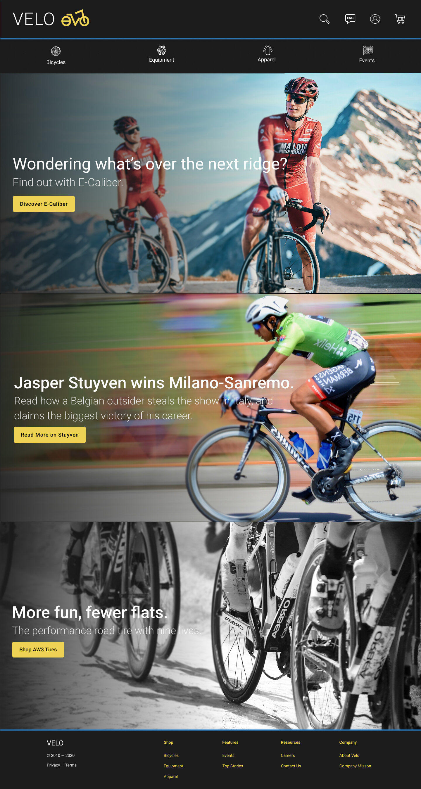
The second iteration incorporated solutions addressing several issues users expressed throughout the first Usability Test.
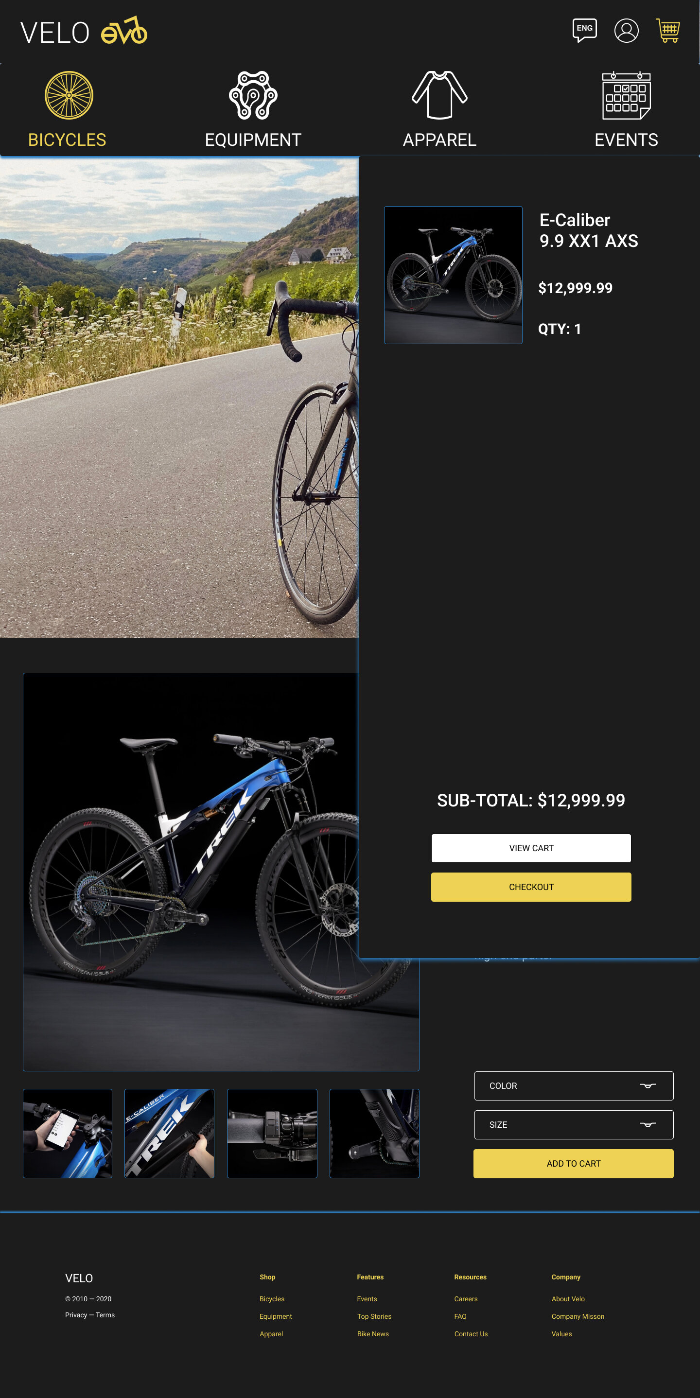
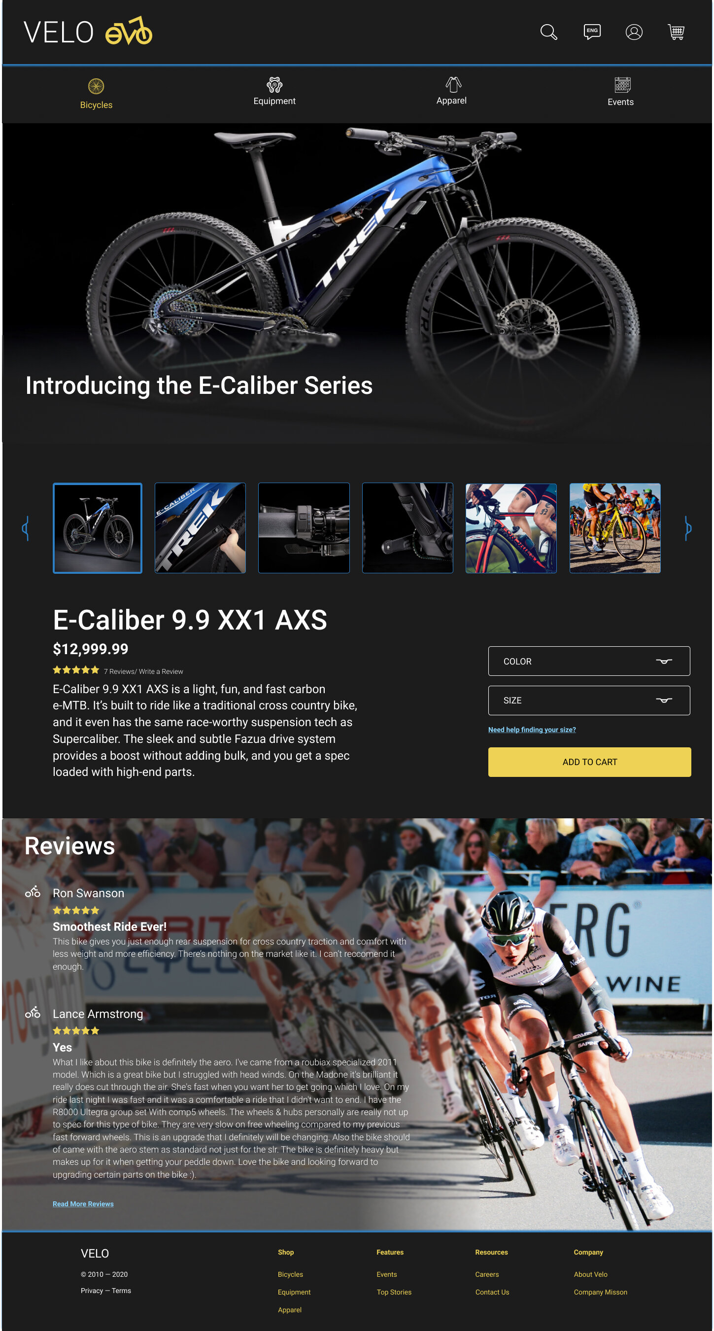
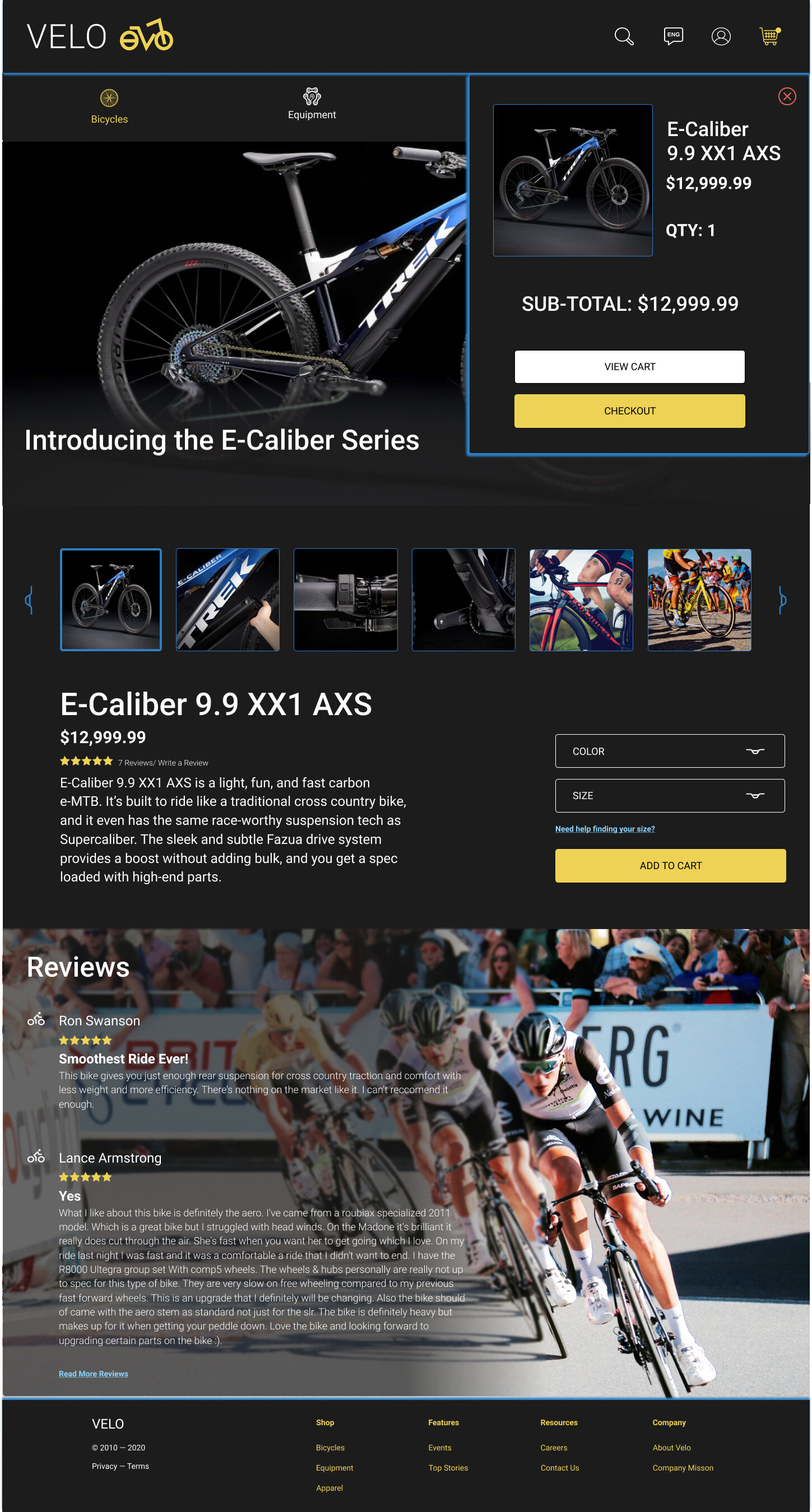
First, despite my adventurous intention of having a navigation bar that moved up and down across the website, users found it extremely difficult to know where to click to proceed through the site. So the navigation bar was placed up top to create consistency. In addition, gradients were added to images with overlapping text to make it easier to read, and/ or click buttons to dive deeper into the website as seen on the homepage and the bike details page.
Second, the order of information on the bicycles browse page was swapped to make it clear to users that they needed to further scroll down for more options via suggested items or through filters.

Prototype: Second Iteration.
Guest Checkout:
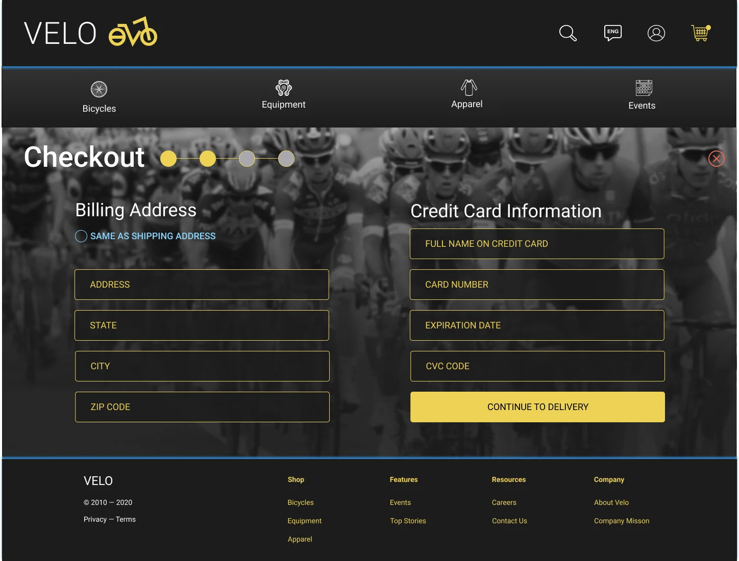
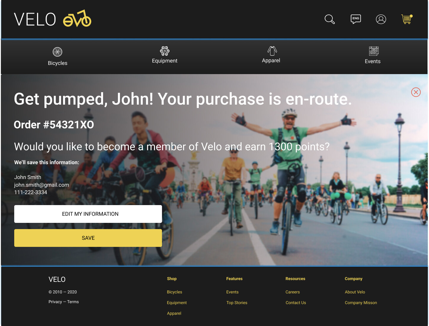
I proceeded with Option B based on testing, but I created a separate page for payment information, and took it out of the introduction page. I created a consistent format where no more than two columns of information were collected from you in one screen. This allows users to complete the guest checkout process in 4 easy clicks!
Users also wanted to see pricing prior to the review order, so I added an additional pricing preview while selecting delivery options.


Usability Testing: Round 2.
Once the second iteration of the prototype was completed, I administered another usability test via a remote virtual hangout to 5 people with the same qualifications as before.
Overall the response was quite positive. The main request I received was to add reviews, in addition to minor edits, like giving users an option/ link to find out which size wheel they need if they don’t know. Those edits were added to the final prototype.
User Interview
Affinity Mapping
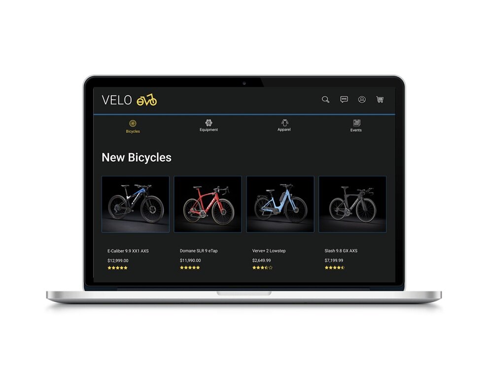
Prototype: Final Iteration.


Reflections.
My favorite challenge from this case study was choosing a product and demographic I knew nothing about personally. UI wise, this style is very different from my usual palette preference, but I’m so glad I pushed myself to explore something completely out of my comfort zone. After this project, I’m very confident in my ability to apply my UX/ UI skills to any task.
If time was not a factor, I would have wanted to further explore the idea of motion within the website. I started exploring this through the navigation tab, but it didn’t perform well among users. However, movement is part of the physical product being sold, and I think there are other ways in which adding it across the site could be more engaging to users. Perhaps some of the images could have been gifs or videos, or an animated progress bar could have been created across the checkout process.
Overall I had a great time with this project from beginning to end and I hope you felt the same when reviewing my case study. Leave any feedback or suggestions if there’s anything you think I can improve on. I would love to discuss it in the comments. Thank you for reading!


