Lifeli

Introduction.
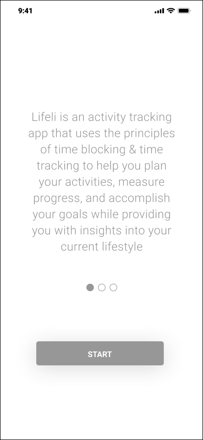
Lifeli is an activity tracking app that uses the principles of time blocking & tracking to help you plan your activities, measure progress, and accomplish your goals while providing you with insights into your current lifestyle.
Users currently need to input 168 hours worth of activity to then receive a life score and information on how they can fix different aspects of their lives in real time. The lifescore is the main rating index provided to users and is based on the average of the duration and kind of activities performed in a week.
We set out to improve the retention and engagement rate by creating a proper onboarding process to educate users on the potential benefits of the app. We also edited the manner in which information was collected from the existing Lifeli app. Now users can attain a lifescore and see results instantly, versus after inputting over 160 hours of events. This was done by creating an initial survey, upgrading the calendar tab, and adding the ability to customize goals.
This was a group industry design project/ contract job created through Springboard for Liferithims, and needed to be completed within a 40 hour deadline.
Role Tools Timeline
Product Designer Figma 04/07/21- 05/10/21
Product Manager Google Slides
User Research Adobe Indesign
Prototyping & Testing Miro
Slack
Zoom
Research.
Client Introduction and Debriefing
Before meeting with the Lifeli team, we explored the mobile app from the perspective of a new user. We found that there were several UI issues including illegible buttons, inconsistent hierarchy and a confusing navigation bar arrangement. As users ourselves we were able to understand that we needed to track our daily activities, but not why or what some of the features unique to the app were about, such as the lifescore.
We then met with the client to understand their motivations for creating the app, who their target user was, and what problems they were looking to solve for. We also reviewed their current data analytics.
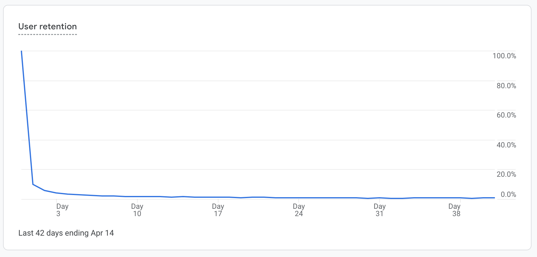

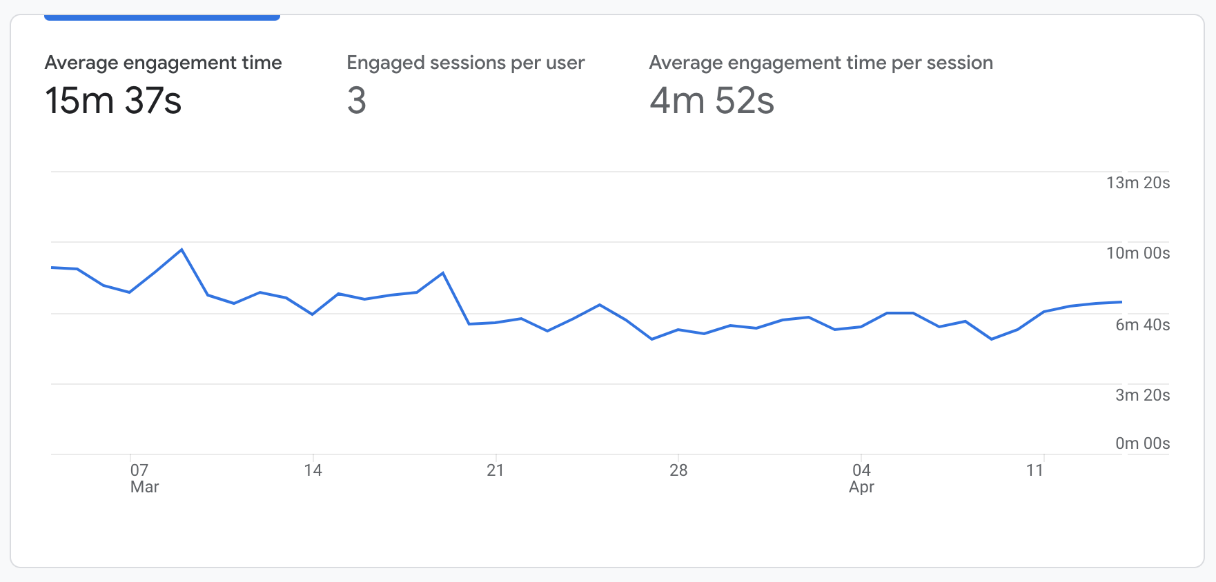
According to the google insights provided to us from Lifeli (as seen above), user retention and engagement drops off pretty quickly, proving to be one of the largest issues within the current app.
Most users appear to explore the app first before inputting information. Some spend a day or two on the app then never come back. Some users drop off within the first couple of minutes.
Survey.
Another prominent issue was that the app did not have a strong target audience. As a group we decided to conduct further secondary research, industry leader studies, and a survey to gain more intel.
We screened candidates for the survey, looking for people between the ages 16-65 who own an iPhone (or is familiar with IOS devices), would consider themselves an organized person, likes to be productive and efficient, and has an interest in their health and constantly improving it.
We asked users about current tracking apps that they use, how they like to form habits, their consistency with these apps, and their drop off rate. Results showed that it’s very difficult to approach habit formation in a “one size fits all approach.” So we did some further secondary research on habits.
Secondary Research.
Confirming our initial hunch on habit formation strategies, Gretchen Rubin, a writer who has authored several books on habits reported to Vox that there’s no one-size-fits-all approach to building better habits. Habit-formation apps can work, but only for certain types of people who respond well to them. Rubin goes further and explains that people fit one of four tendencies when it comes to habit formation:
So habit-formation apps can be efficient, but only for certain user types who respond well to them. These kinds of user-centered apps are directive on formatting the habits of users into becoming their ideal selves. If you continue to use the app, you can become a person who practices good habits.
https://www.vox.com/the-goods/2019/1/2/18158989/habit-tracking-apps-new-years-resolutions
https://gretchenrubin.com/2013/10/what-kind-of-person-are-you-the-four-rubin-tendencies/
User Personas.
This information helped us create two users personas: Organized Olivia and Curious George. Both are actively trying to live a balanced lifestyle. The manner in which they build and keep habits is different, but Lifeli can assist them both.
The goal of Lifeli is to provide visual data to its users, so that new habits and changes can be applied to the person’s life in real time.
Information Architecture.
Sitemaps.
Now with a strong understanding of who our users are, we began to draft a plan to uplift parts of the app and figure out a solution to increase engagement. First we created the app’s current sitemap (below). We then reviewed the initial UI issues we experienced, and created a new sitemap to help with navigation and accessibility.
Sitemaps help me as a designer understand which tabs are really important for optimal navigation. By reorganizing the app’s current offerings into a clear navigation bar (see below), information is much easier to access.
We decided to focus on three red routes to build out within the prototype:
1) Onboarding and Education.
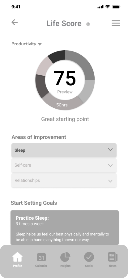
2) An initial survey and home screen featuring a preview Lifescore.
3) Building out the calendar and goals tab with gamification features.
Ideating.
Low Fidelity Mockups: Sketches
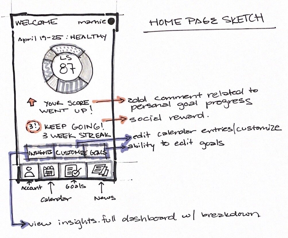
Once we finalized the new sitemap, I started sketching ideas within my notebook, allowing me to be messy and explore layout options. The existing app took users straight to the insights tab, which is a lot of information to digest at once. Similar to how most banking apps work, I began experimenting with a home screen, providing users with a preview of insights and related notifications.
i also sketched some calendar views and notification screens, since that was difficult to read, and not intuitive in the existing app.

Mid Fidelity Mockups: Wireframes
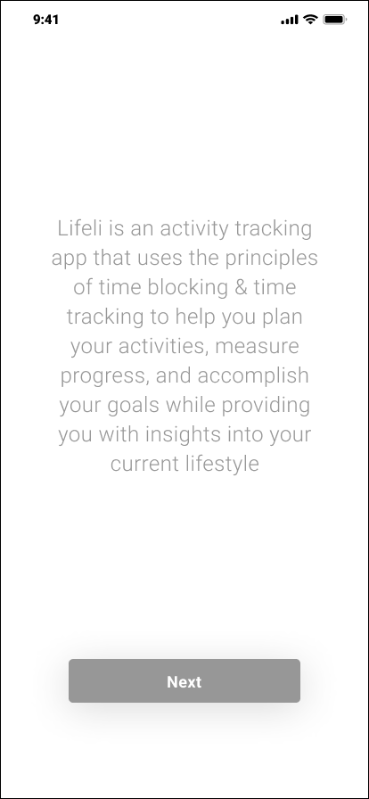
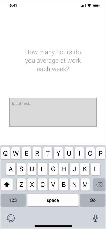
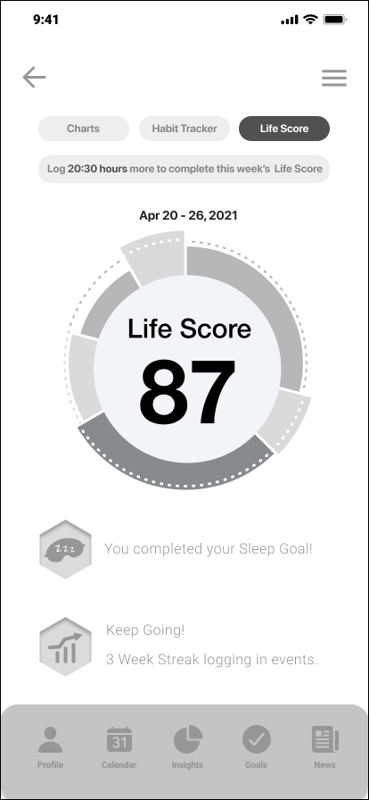
From there, the team created wireframes to get a better understanding of how to inform users of the app, and ask initial survey questions as simply as possible. We also had to test out how to make dashboards and notifications appealing to read.
Because Lifeli has an existing brand identity and color palette, we did not focus on incorporating this element into the design until the very end.


Prototype: First Iteration.
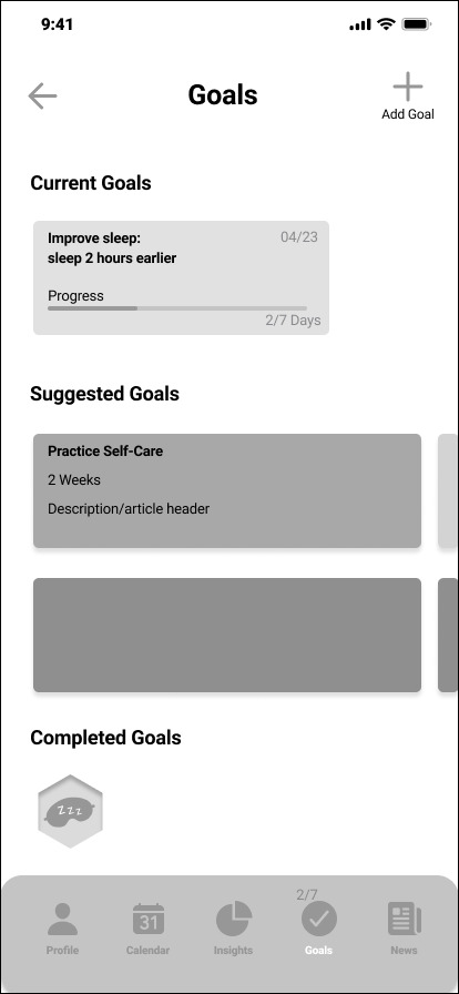
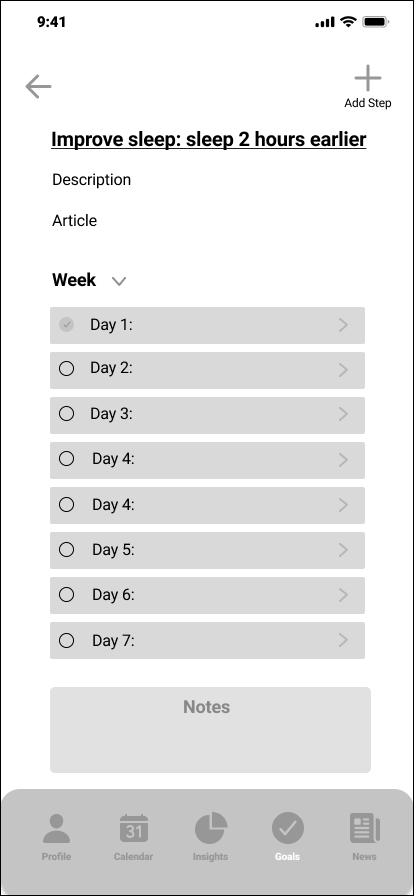
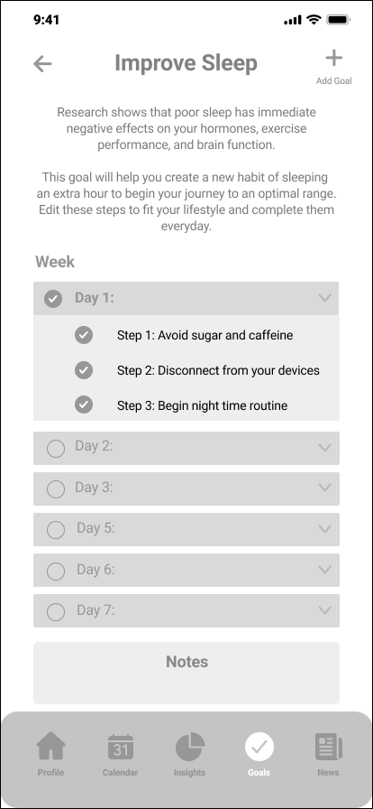
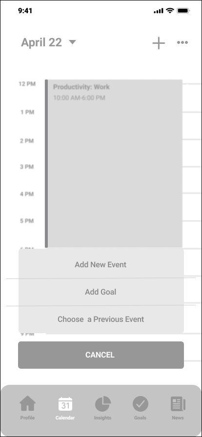
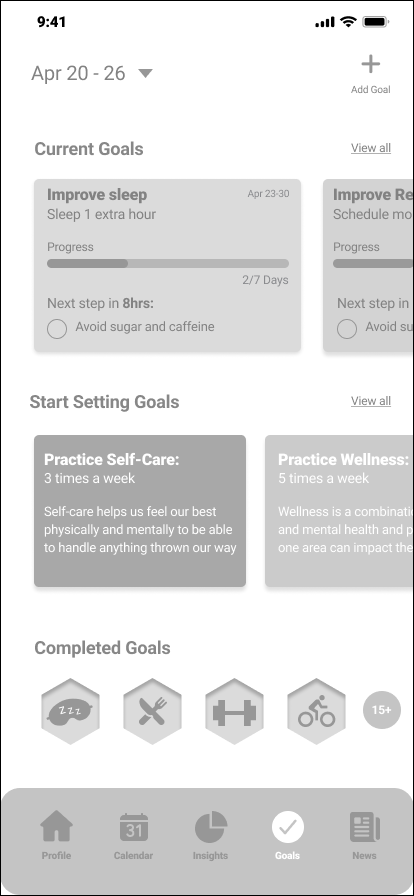
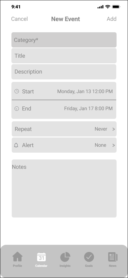
From there we added more text to the onboarding screens, and completed our survey questions that will help users get an initial lifescore. We also built out the calendar views, and goals tab. We added badges to encourage people to create goals and follow through with them. Once we finalized all of our initial screens we created our first prototype.




Usability Testing.
Once the first iteration of the prototype was completed, I administered a usability test locally at a pre disclosed location to 5 people. The objective was to observe their initial impressions of the home page, calendar, and goal tabs, and more generally of their onboarding experience as new users.
Participants:
5 Users aged 16-65
Owns and iphone, or is familiar with IOS devices.
Would consider themselves an organized person. Likes to be productive and efficient.
Has an interest in their health and constantly improving it.
Affinity Mapping Results:
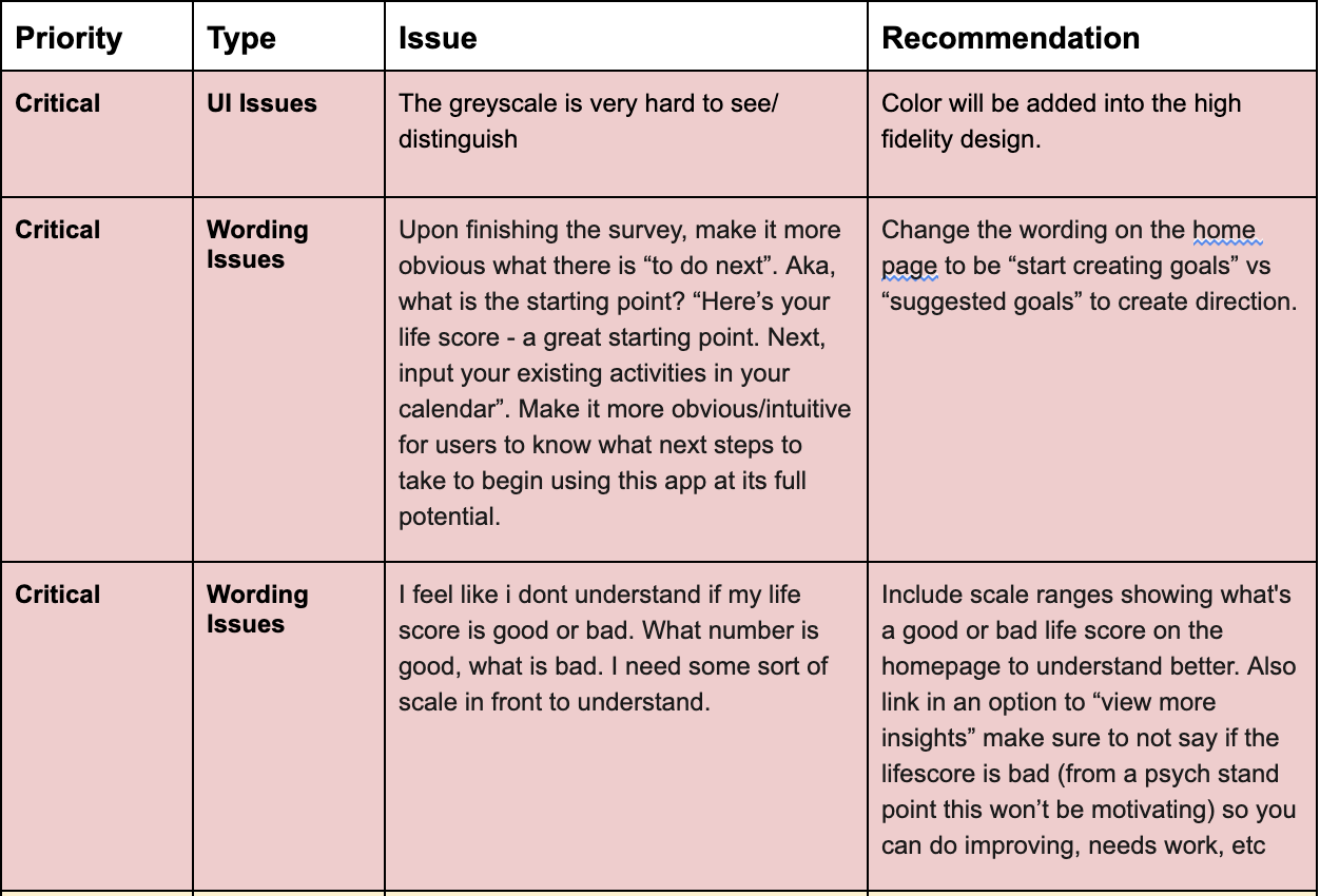
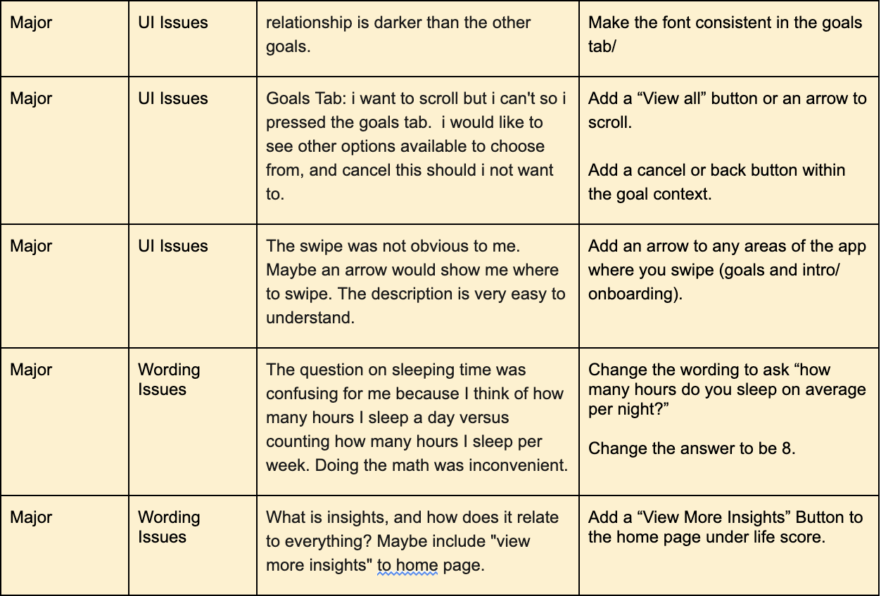
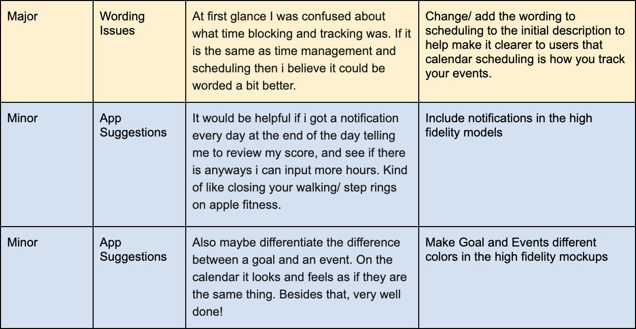
Through Affinity Mapping (see above) the prototype served its purpose and was overall functional and informative to users. There were two main areas that could be improved: wording issues and UI issues. There were also a lot of suggestions users listed, along with personal preferences. This makes sense in accordance to the initial secondary research in that a “not one size fits all” approach to habit building.
Issue #1: Wording Issues
Wording Issues, such as explaining the ranges of the lifescore to know what is a good or bad result, as well as making it more obvious “ what to do next” along the home screen and goals page.
Issue #2: UI Issues
The user face issues were minor and quick fixes such as adding arrows or “view all” buttons to indicating that there is more information to read.
Below are the reported issues listed in hierarchy of critical to minor to fix within the prototype.
Prototype: Final Iteration.
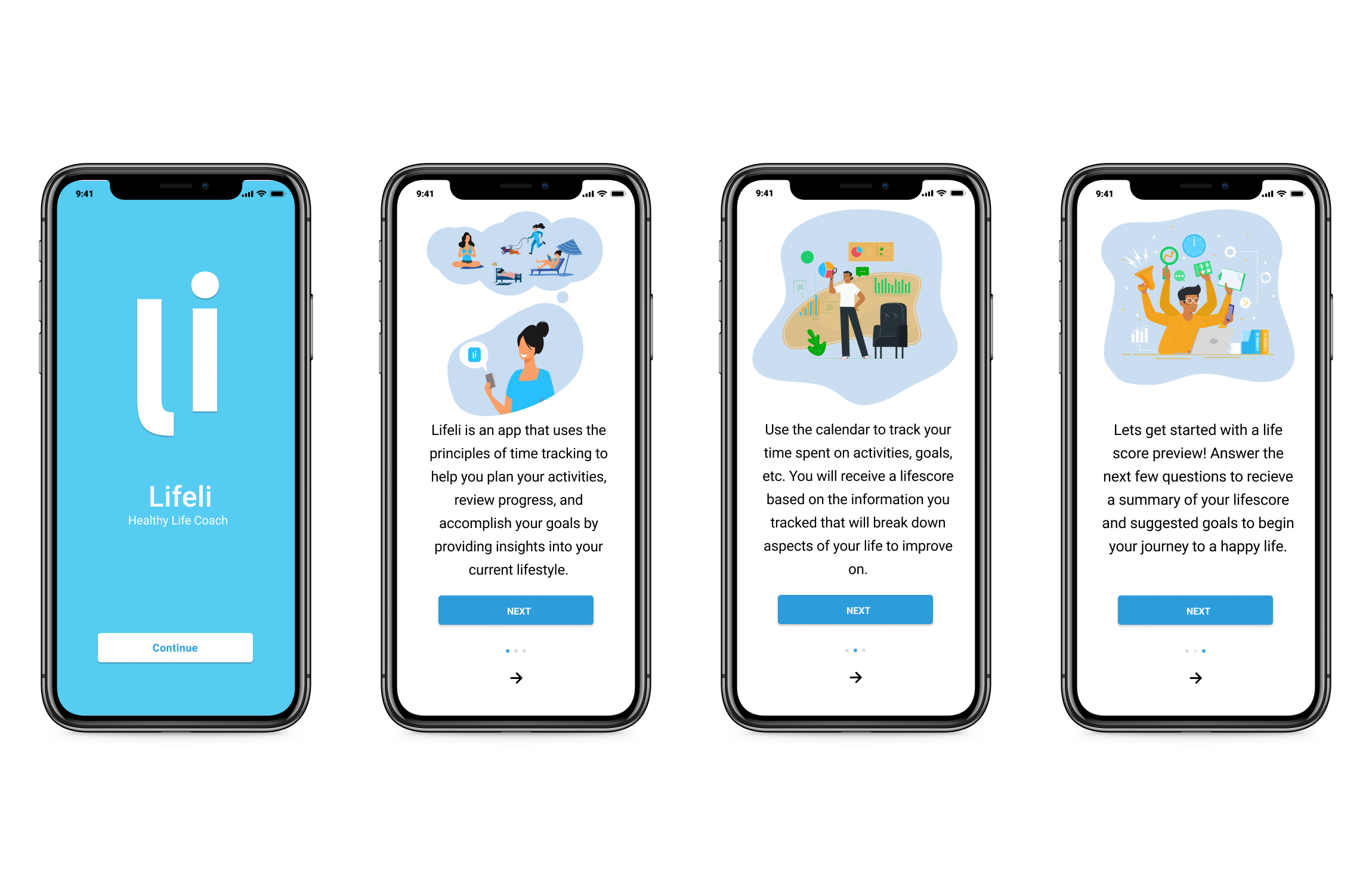
Onboarding and Education
The final iteration incorporates solutions addressing several issues users expressed throughout the Usability Test.
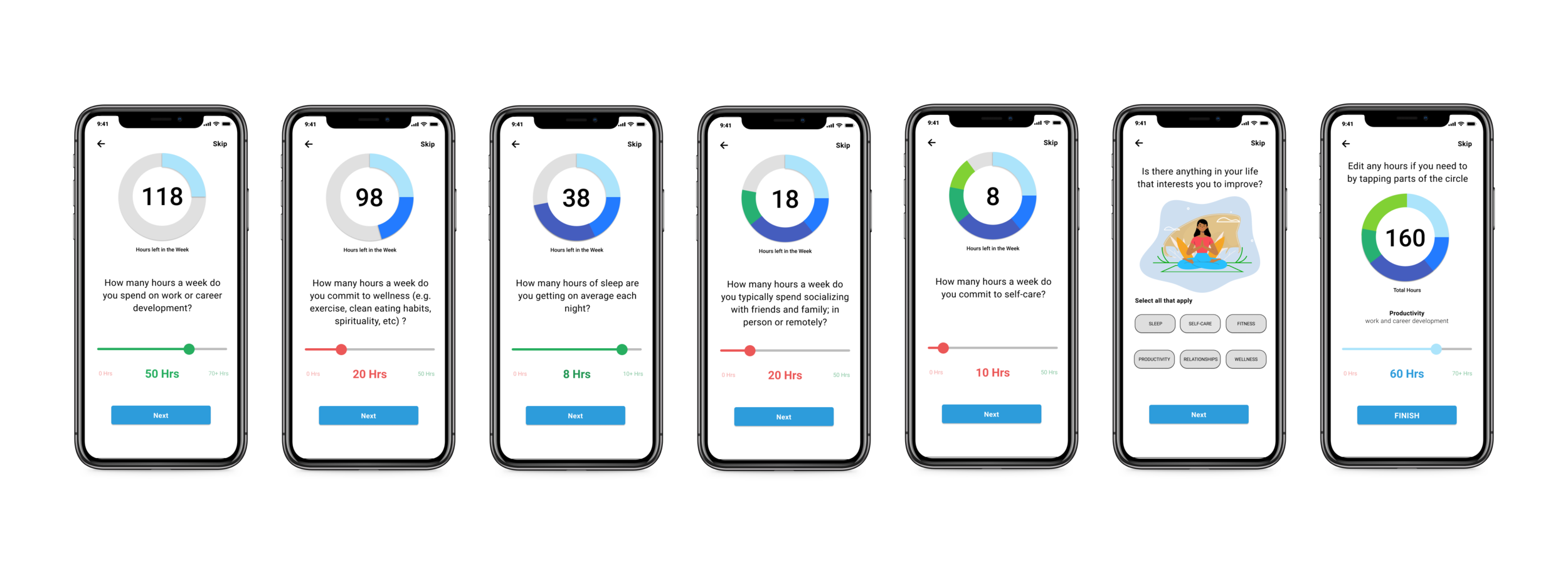
To start, the new user gets walked through an educational introduction of Lifeli’s purpose. They then get brief instructions on how to use the app to receive a lifescore, and its significance. Lastly it introduces you to the reasoning behind the survey to follow: to collect data to and offer an initial lifescore to new users instantly.
Initial Survey and Dashboard
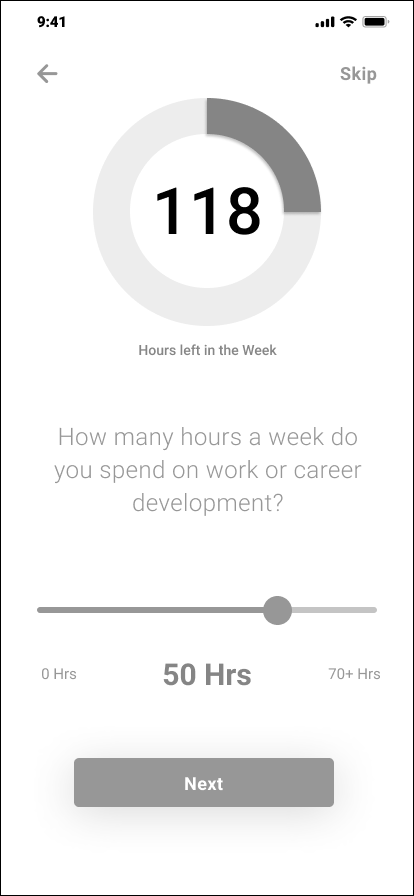
The initial survey asks users six simple questions collecting time blocking intel to create an initial lifescore instantly. There is also an opportunity for users to select areas of their life they want to improve such as sleep, productivity, wellness, relationships, or selfcare.
Home Screen Dashboard
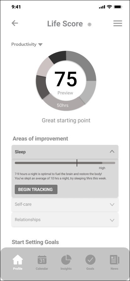
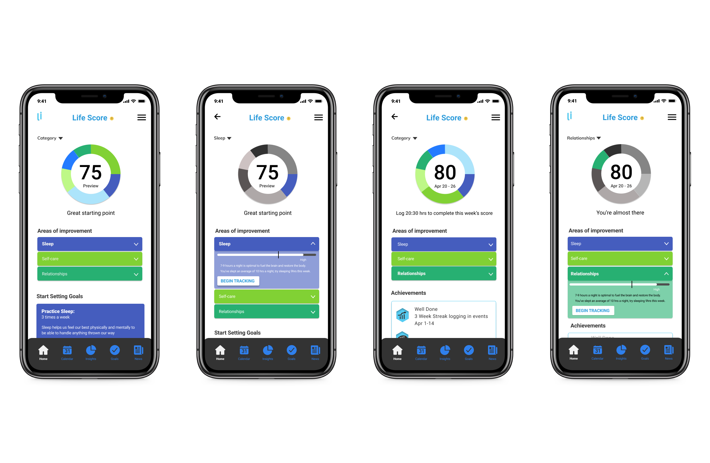
There are two iterations of home screens shown below. The first two screens show a prototype of the preview lifescore users see after completing the survey. The second two screens show what an existing user would see on the home screen after being consistently active on the app.
Goals and Gamification
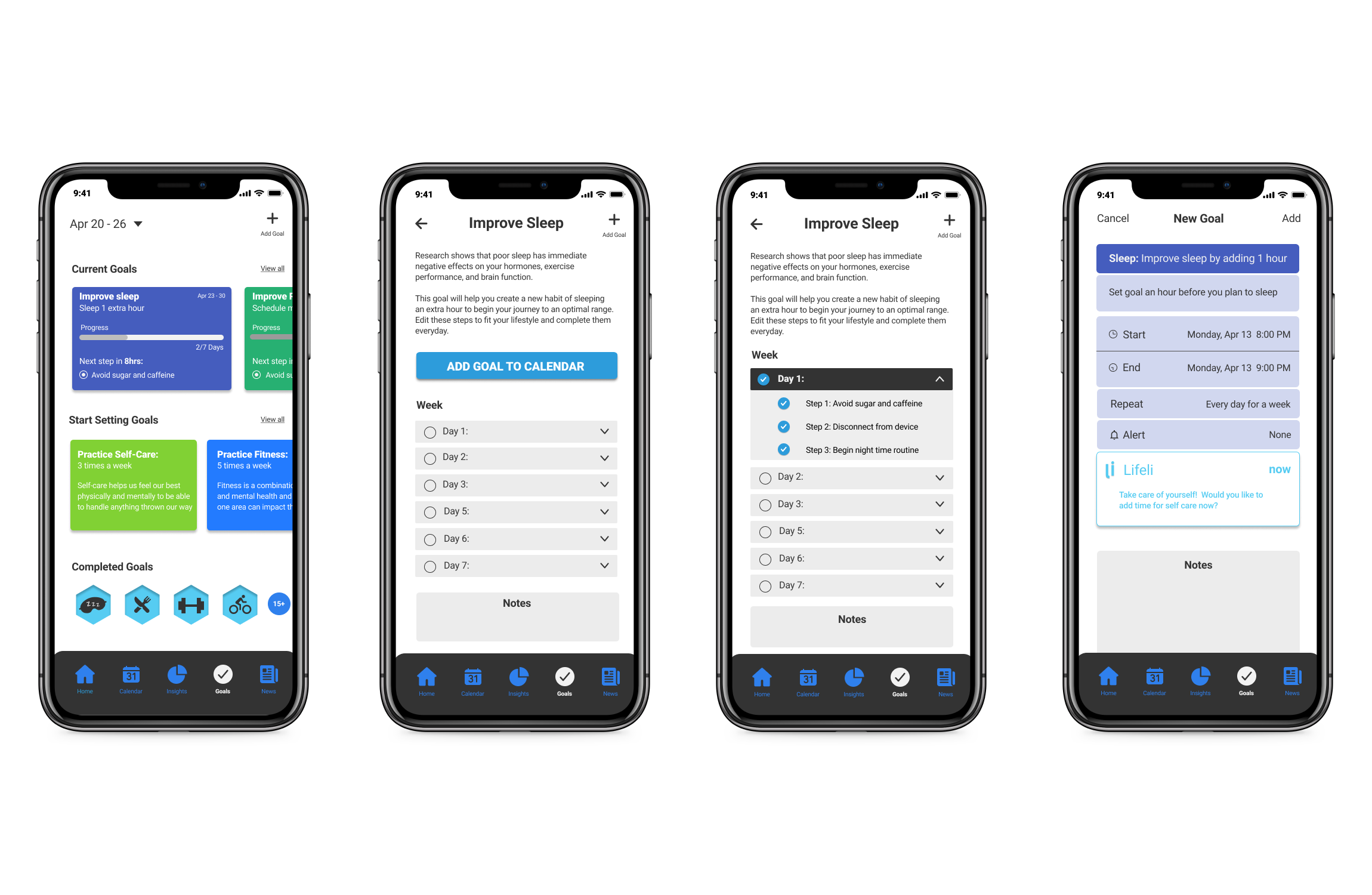
According to Gretchen Rubin, “there’s a basic structure to habits, which is that there’s a cue, a routine, and a reward; this is called the habit loop.” The key to forming a new habit is to diagnose what are the current cues and rewards that are driving a person’s current habits and then to try to come up with new cues and rewards for new habits.
The goals page offers all three through the suggested prompts, a cue, a routine and rewards.
Reflections.
I enjoyed learning about the Lifeli app and was excited to help customers better their life. My favorite challenge from this project was working with my two team members with different backgrounds and strengths to complete the scope within a short time frame.
I had a great time with this project from beginning to end and I hope you felt the same when reviewing my case study. Leave any feedback or suggestions if there’s anything you think I can improve on. I would love to discuss it in the comments. Thank you for reading!


