Peer Planet
Knowing how to care for the world is now in the palm of your hands.
Introduction.
Climate change is one of the most prominent concerns of this century. Most people are aware sustainable changes need to take place within one’s daily life, but are not quite sure how to, or where to start. There is a lack of accessible information on conscious consumerism.
I set out to create a brand new product called Peer Planet, a friendly and easy to use app that aims to be a source of truth for conscious consumerism. The platform offers different resources to help the user make greener choices, and stay informed on sustainable news.
This was a solo project created for Springboard, and took approximately 2 months.
Role Tools Timeline
Founder, Sketch December 2020-February 2021
Product Designer, Miro
Product Strategy, Overflow
User Research, Invision Studio
Visual Design,
Prototyping & Testing
Research.
Secondary Research.
Initially, with the pandemic hitting small businesses the hardest, I set out to see what I could do to help.
Local Shops struggle to stand out and connect with conscious consumers, versus big name brands.
So I did some research. Competing against big name retailers proved to be extremely difficult. Even Amazon, currently the biggest retailer of them all, created a Local Shops Program within their website to help small businesses. Therefore, it would not have been impactful for me to continue the capstone project in this direction.
Realizing this, I began to look for alternative ways to assist users with conscious consumerism.
Local Shops Program on Amazon
“Over 50 percent of sales on Amazon are made through third-party sellers. In its 2020 Small Business Impact report, Amazon revealed it shipped out more than 3.4 billion third-party items in just one year.
[The vendor] will be able to reach more potential customers and increase sales of first-time customers who may be leery of shopping on a lesser known website.
And it’s easy too. Using Amazon’s ‘Seller Central’ dashboard, you’ll be able to manage an online business without your own website and letting Amazon handle all the grunt work.”
Brian Edmondson
User Interviews.
While I continued to research, I began screening candidates for the User Interviews. A survey was sent out to recruit people between ages 16-65 who shop online more than 3 times a month and have some interest in sustainable practices. Out of the 25 surveys sent out, 5 candidates were chosen based on submitted responses.
Two interviews were done virtually, and three were done in person. A little more than 20 questions were asked, and interviewees' answers were categorized through Affinity Mapping.
Affinity Mapping.
First I noted prominent comments and concerns each user had onto post-its. Several similarities started appearing, and I was able to categorize the post-its into three categories: Sustainability Engagement, Sustainability Awareness, and Liked Shopping Feature. What stood out to me the most from my findings was that during user interviews, several users said,
“Hmm I don’t know where I learned about sustainable practices actually. Maybe word of mouth, or social media.”
This led me to realize there is a lack of accessible information on conscious consumerism, and that was something I could help with.
“Hmm I don’t know where I learned about
sustainable practices. Most likely word of mouth,
or social media.”
— Alexis Romero, Interview Candidate
Empathy Maps.
Along with the affinity maps, I began organizing post-its into other categories: emotions users were thinking and feelings, resources they were seeing, actions they were saying and doing, as well as things they were hearing. Moreover, they expressed the pains and gains of it all. Despite the diversity in users, everyone felt the same pain: lack of accessible information.
User Personas.
This information helped me create two users personas: Conscious Coonie and Average Adam. The targeted audience for the app can range on how informed they currently are on conscious consumerism. Never the less, what matters is that they find the topic important, and want to participate in positive change.
The goal of Peer Planet is to be a source of truth for conscious consumerism that's easy to use. The feel of a peer chatting with you, versus a collection of google links.
Information Architecture.
User Stories
Creating user stories helped to form direction when it came to users‘ needs and goals. The user stories maps helped visualize how a real user would solve a goal or task such as recycling or shopping locally. I was able to prioritize said tasks and create an MVP.
Site Map
This then allowed me to organize the features I wanted to include in the app. I created a detailed sitemap using Miro to serve as the guidance to design user flow.
User Flows
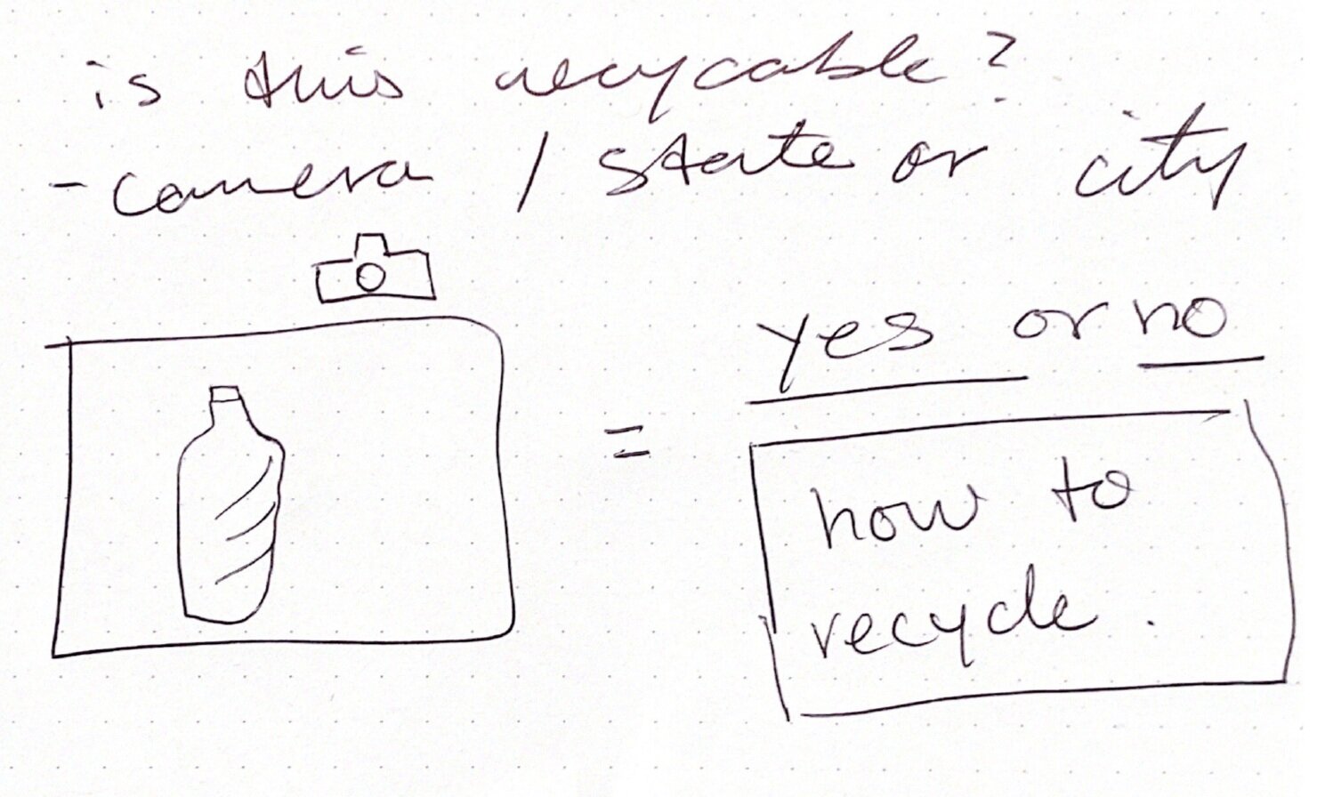
The user flows helped me as a designer understand which pages or screens are really important for an app or website. This ultimately led me to finalize three red routes to build out within the prototype: 1) Recycle AI lens Route, Shop Search and Discovery Route, and News Category Route.
Ideating.
Low Fidelity Mockups: Sketches
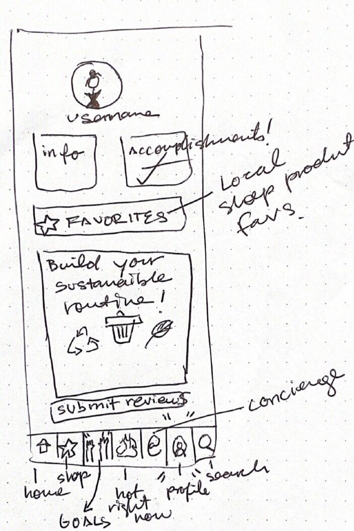
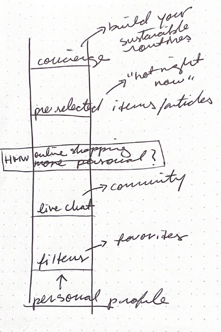
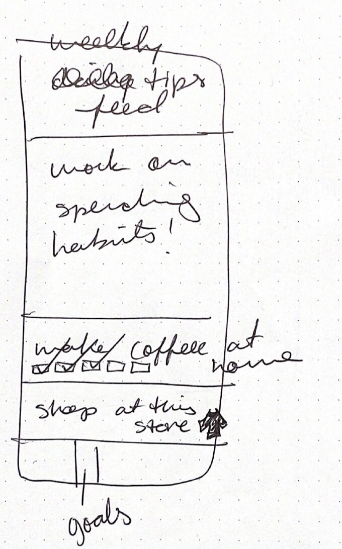
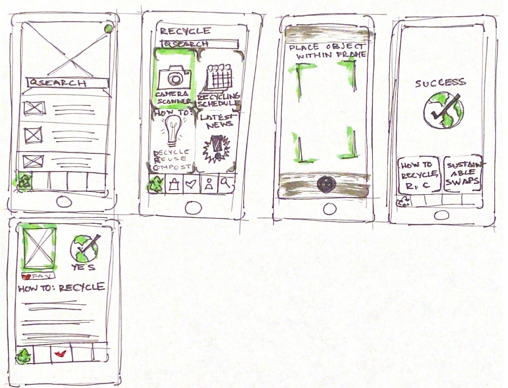
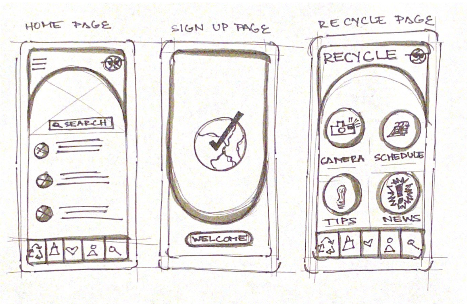
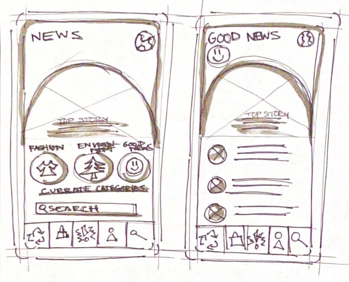
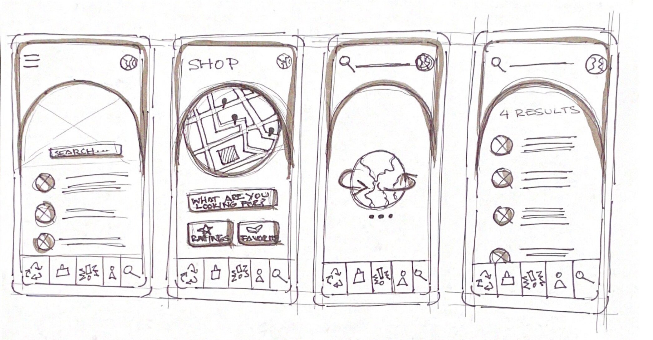
First I started very casually sketching ideas within my notebook, allowing me to be messy and explore. From there, I started thinking about incorporating the navigation bar, a menu page of some sort, and incorporating the camera into the UI. I wanted imagery to guide the user through the app.
Mid Fidelity Mockups: Wireframes
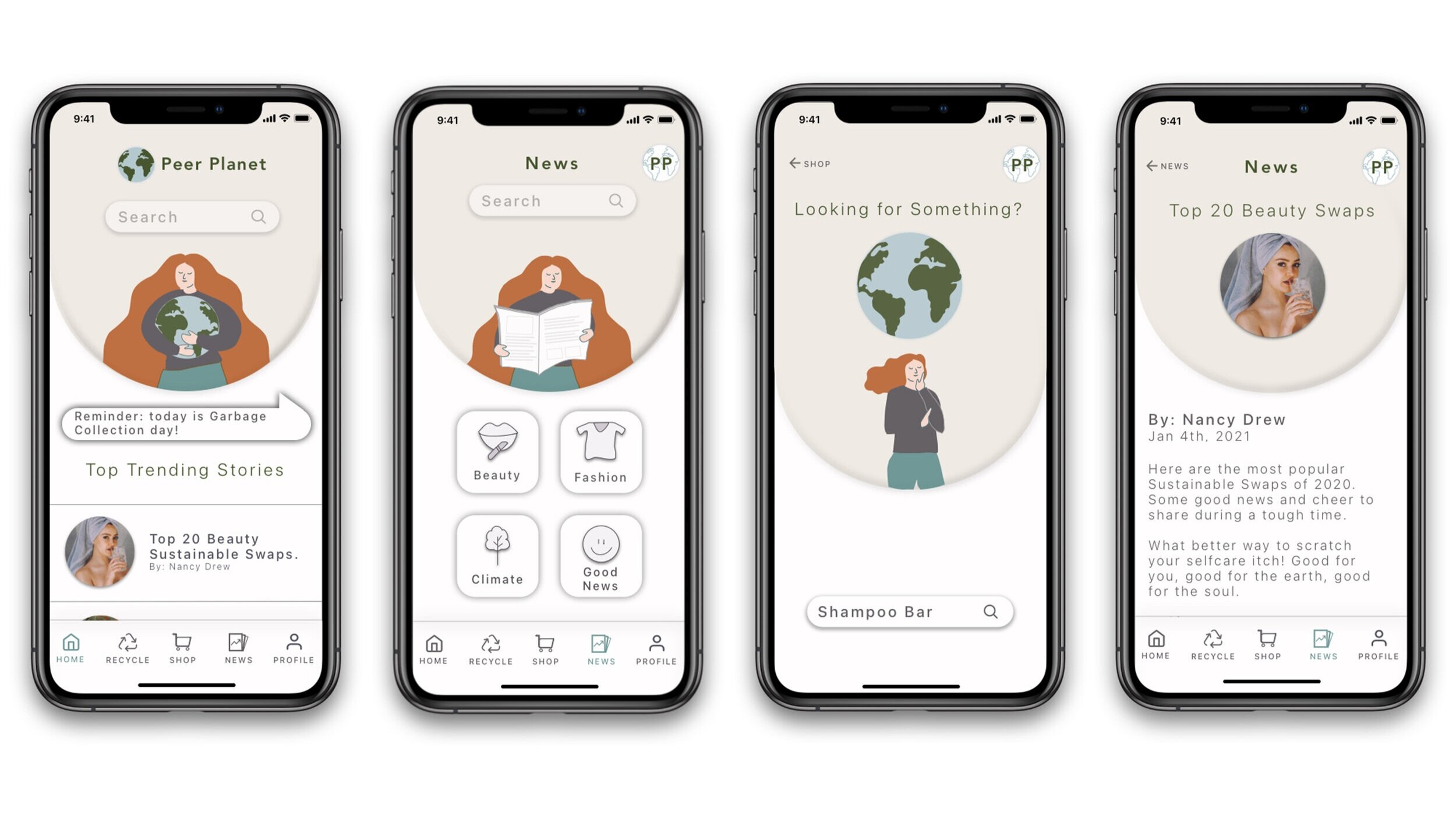
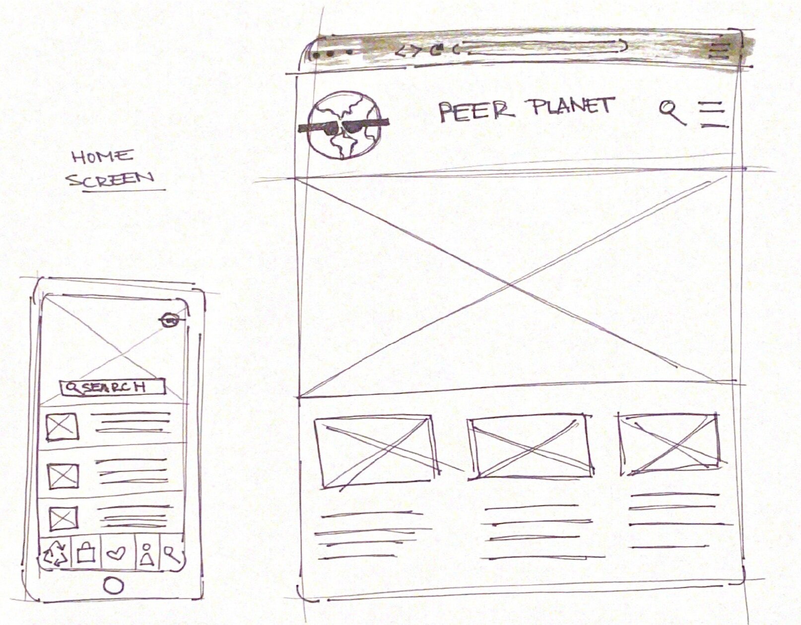
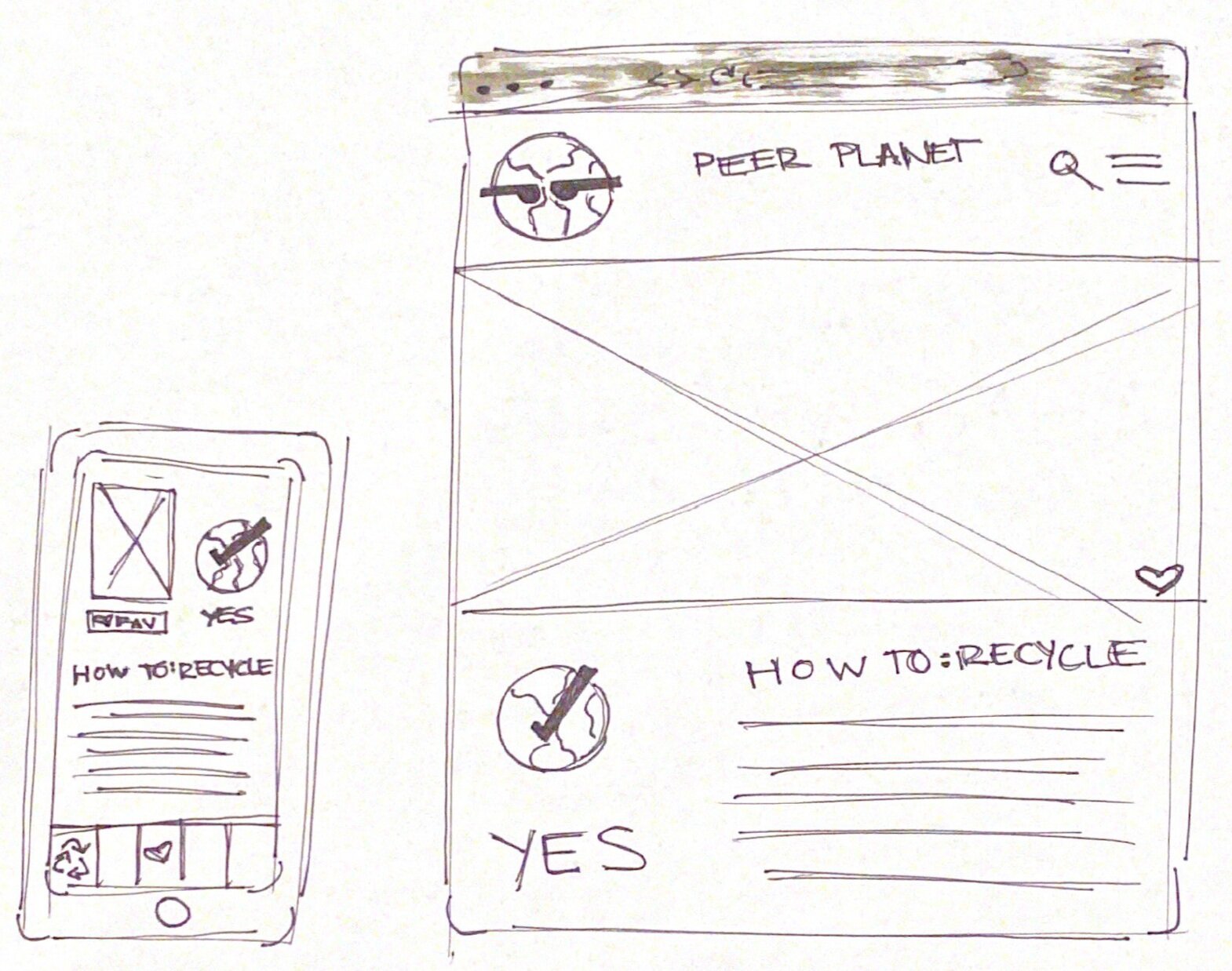
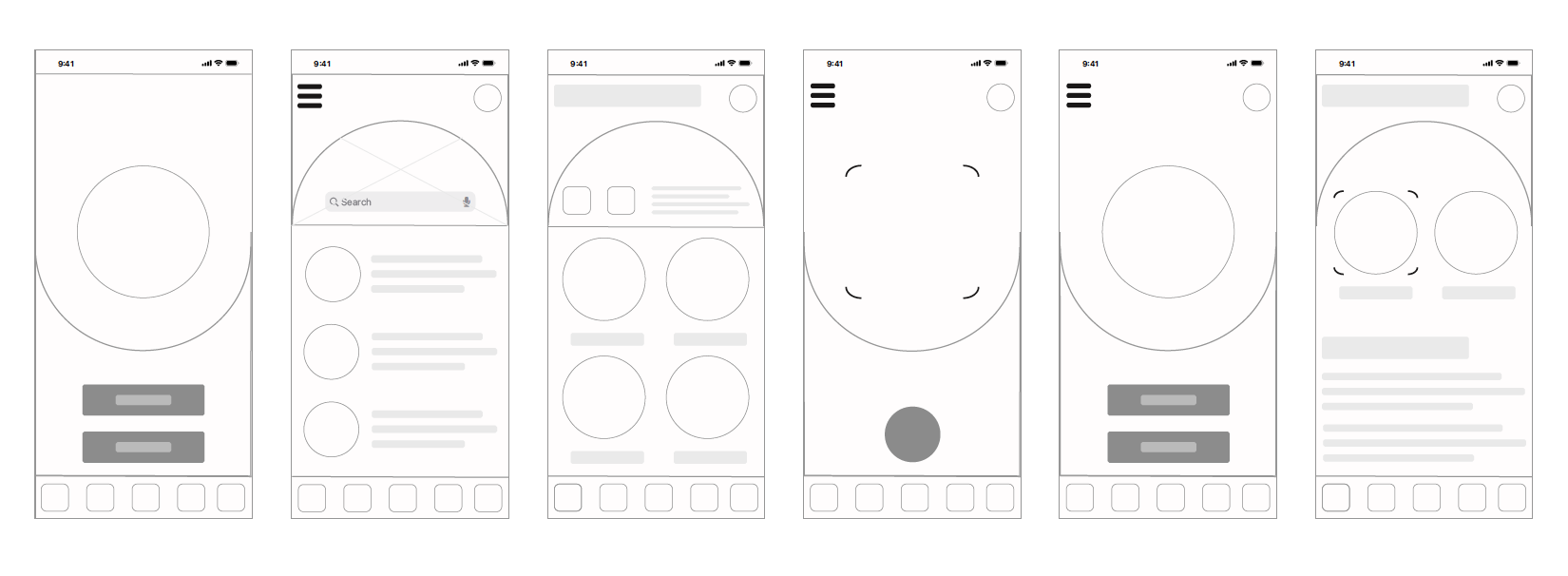
From there I created high-fidelity sketches, where I incorporated curved shapes to create different areas within the page. According to statistics, users find curved shapes and edges friendly and more inviting than sharp angles. While this app will be information heavy, the idea is for the platform to be a fun resource. Plus the curved shape mimics the shape of our planet, which nicely ties in the app messaging.
After analyzing these sketches, I began creating Wireframes on Sketch to finalize proportions.
High Fidelity Mockups: Color and Illustrations
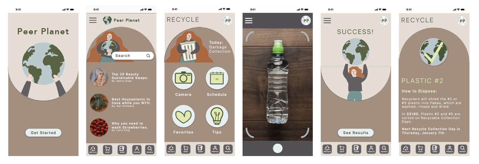
I then started adding color and illustrations to the wireframes. The “Mother Earth” illustration became a prominent symbol across the platform, guiding the user through different tabs, and helping users complete tasks. It was important she always had space to inform. It was then that I decided that the curve shape would consistently face one direction to allow a natural separation between her messaging and the information provided on each page. The color palette was also toned down to create a soft, less distracting interface to allow users to focus on the content.

Prototype: First Iteration.
Usability Testing
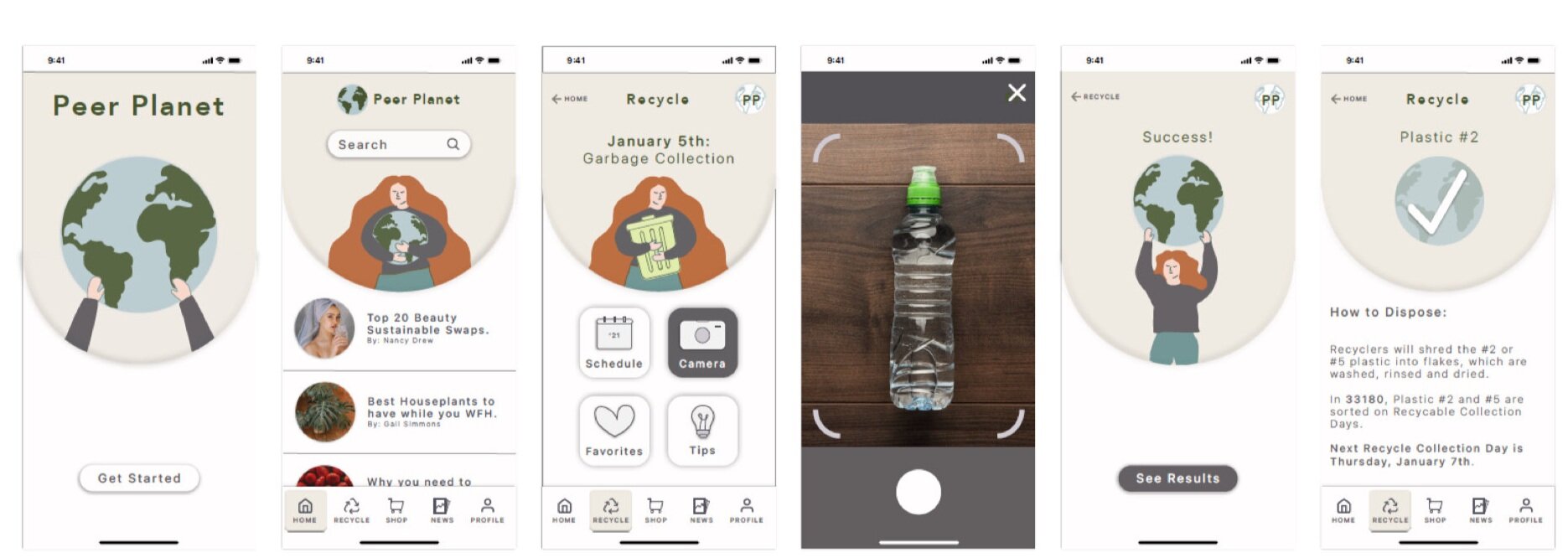
The usability test was done locally at a pre disclosed location to 4 people. One was done via a remote virtual hangout. Because the program is measured to a specific screen size and not translatable across all phones yet, I asked users to test the app via my desktop, a controlled device. I was the facilitator, and provided instruction if needed. I also took notes and observed the session.
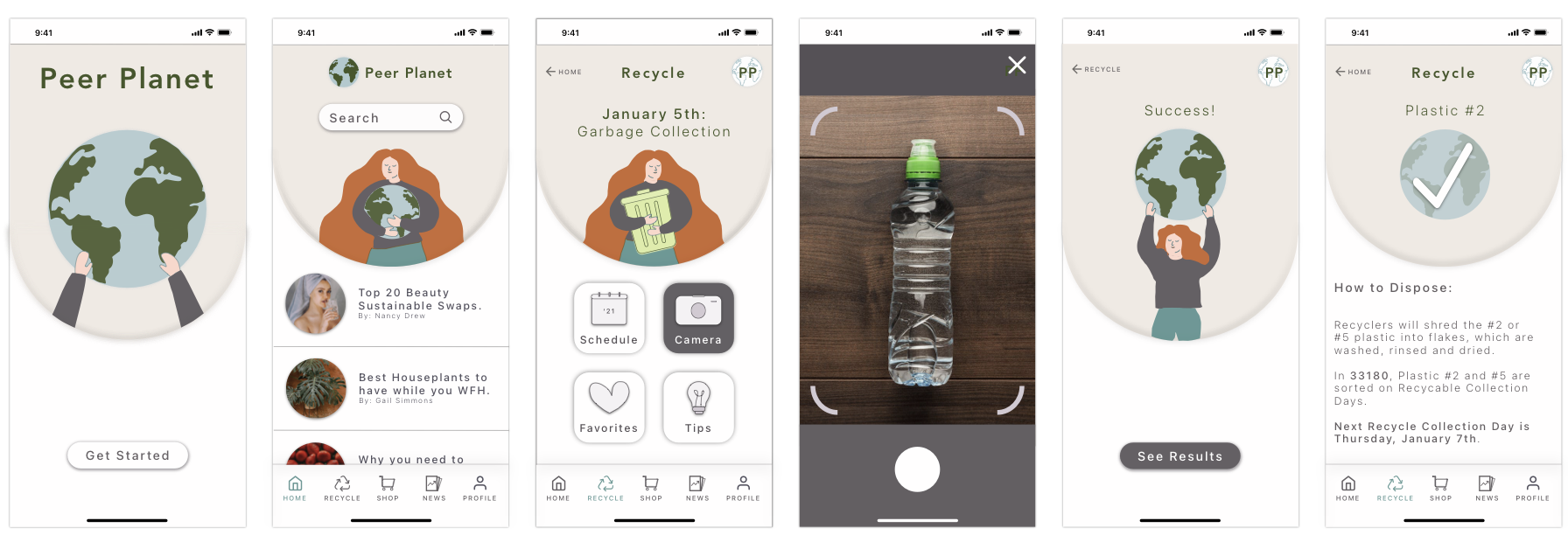
The three main issues were: The feed could not be scrolled through, the transition from tabs to the Home Screen was excessive and clunky, and there was little difference between the Home page and the News tab. Appropriate changes were made to create the final prototype.
Prototype: Final Iteration.
Style Guide.
Reflections.
I was excited to pursue a project that could help people become more conscious consumers. Personally, Peer Planet was the perfect opportunity for me to hone into since this is one of my biggest concerns in life. My favorite challenge from creating Peer Planet was incorporating AI lens technology into my app to help people strengthen their most prominent sustainable practice; recycling.
I had a great time with this project from beginning to end and I hope you felt the same when reviewing my case study. Leave any feedback or suggestions if there’s anything you think I can improve on. I would love to discuss it in the comments. Thank you for reading!


