House 2 Home Design Sprint
Introduction
House 2 Home is a decor selling website. Users most often have a style idea in mind, but don’t know what items to select or prioritize. They need help selecting items to buy that are unique to their taste, cohesive together in a space, and are budget friendly.
I set out to pursue two main solutions for the issues presented. First, I created a way for the user to experience a sense of personalization through a questionnaire. The second solution aids users in understanding how the selected accessories are cohesive through an organized UI interface.
This was a solo modified Google Ventures design sprint created for Springboard, and took approximately five days to complete.
Role
Product Designer
Product Strategy
Visual Design
Prototyping & Testing
Tools Timeline
Marvel February 18, 2021- February 25, 2021
Miro
Sketch
Day 1- Research
The brand identity, concept, research, personas, interviews, and design constraints were all provided for this design sprint.
Research Findings
A pattern I see develop within user testimonials, is that they all are looking for help with item selections specific to their taste and restrictions. During the provided recorded interview, the interviewee mentioned she wishes she could afford an interior designer. What do interior designers bring to the table that users can’t get on their own? Customization! Designers get to hear about your design desires and restraints, and then put it all together cohesively.
Day 1- Mapping
As I start imagining what digital customization can look like, I start thinking about important elements a real interior designer would need to know before making recommendations to clients. How do they collect this information? By directly having conversations and constant dialogue with their clients. They ask questions, and look for answers.
I then immediately started sketching what this ‘back and forth’ discussion would look like if a user were interacting with a website versus an interior designer. A questionnaire survey began to form. The idea of further customization/swaps after the initial package was offered also began to take shape.
Day 2- Lightning Demos
Below are the examples reviewed during the Lighting Demo phase.
Brooklinen
Brooklinen, a bed sheet and towel company, has a questionnaire leading you to products, and categorizes accessories cohesively through categorized styles.
Fab Fit Fun
Fab Fit Fun is a beauty subscription model that comes with prepackaged boxes/ products with an option to customize a few items within the collection. Plus it offers different services through price point.
Havenly
Havenly is a Design app that connects you to an interior designer, who creates a mood board or floor plan specific to your space. This service is best for customers looking for a large design haul. They charge a flat fee for their decor reccomendations, and make additional commission from items suggested. Similar to the other examples, they also have a style quiz.
Day 2- Sketching
The questionnaire feature mentioned earlier, would provide users a platform to share as much information as possible to the site. Based on the answers provided, House 2 Home can then collect intel to make algorithmic design decisions for the individual customer. I participated in the ‘Crazy 8s’ brainstorm exercise with this in mind, sketching different visual options of how to question and collect data from users.
The UI for the questionnaire, and the results thereafter, need to be easy and interactive to retain the customer’s attention.
Users mentioned they have a hard time seeing things go together and need help doing so. In regards to viewing the results from the questionnaire, I tinkered with the idea of the curated set being presented through multiples images.
After reviewing all my ideas, I focused on one main photo, showing all decor items placed together in a space cohesively. Then smaller images nearby can illustrate each individual item within the set, and even offer the option to swap out elements. The main styled image could aid the user, providing inspiration to style their own home.
Day 3- Deciding and Storyboard
Rather than focusing on checking out, or any other standard action within retail websites, I decided to further pursue two main solutions. First will be creating a way for the user to experience a sense of personalization. For this, the questionnaire method explored through sketching will be further developed. This would also allow the platform to collect the appropriate information to offer the best product for the customer, on top of the best experience.
The second solution will aid users in understanding how the selected accessories are cohesive. The original storyboard sketch will play into the UI interface. Breaking up a combined image into each individual item.
Day 4- Prototype: First Iteration
With the idea of building the prototype quickly (and editing any errors/ discrepancies later on), I used Marvel to layout the sketched wireframes.
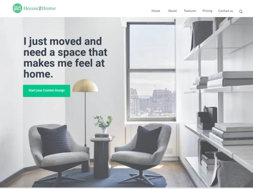
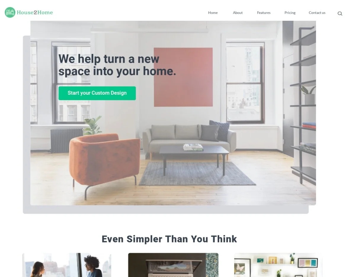
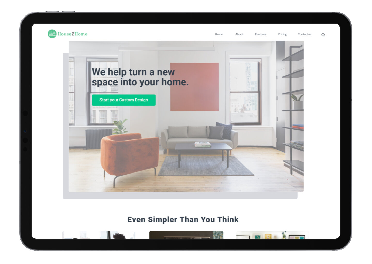
To start, I created a basic Homepage with enough information to explain the logic behind the questionnaire and the results you will receive in exchange.
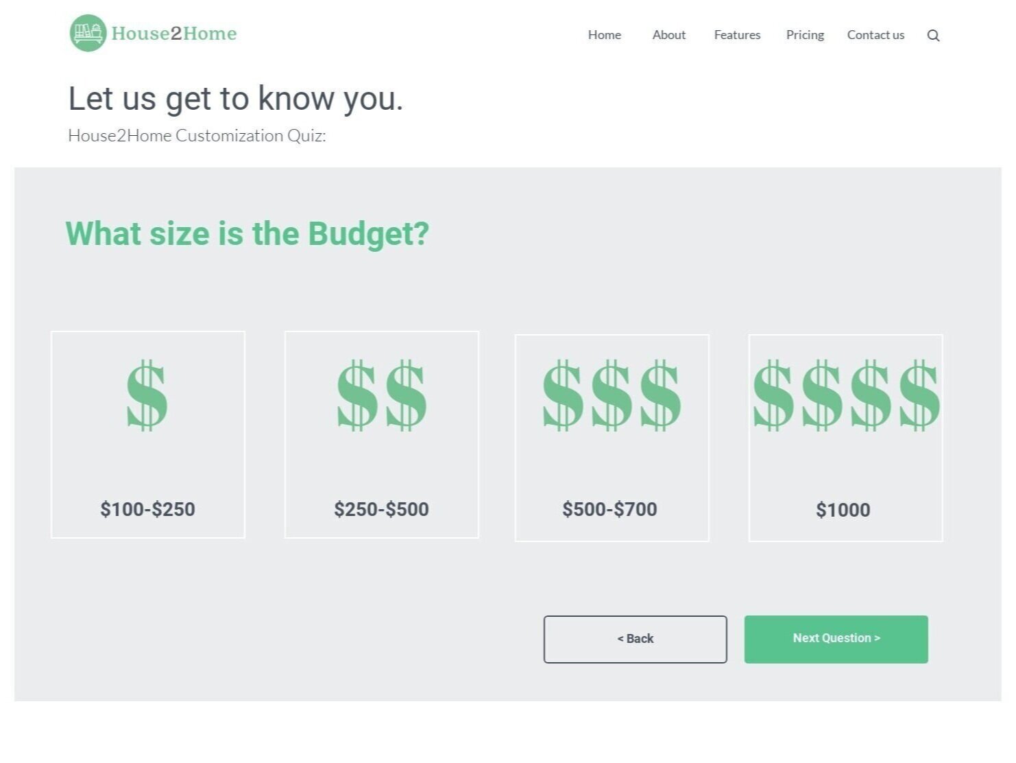
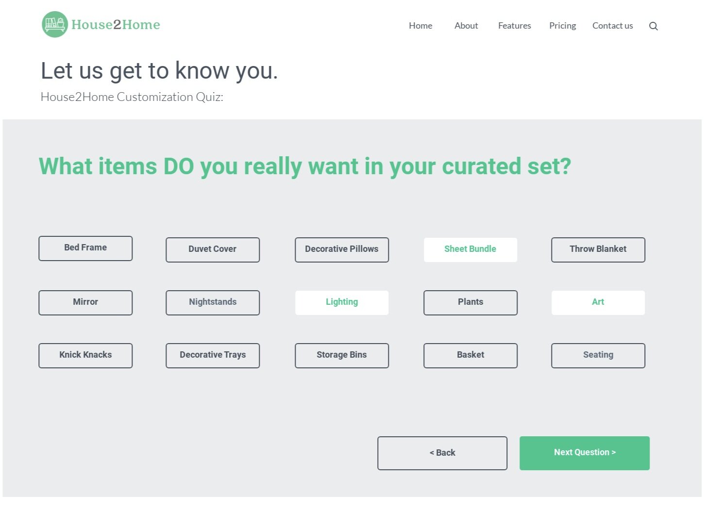
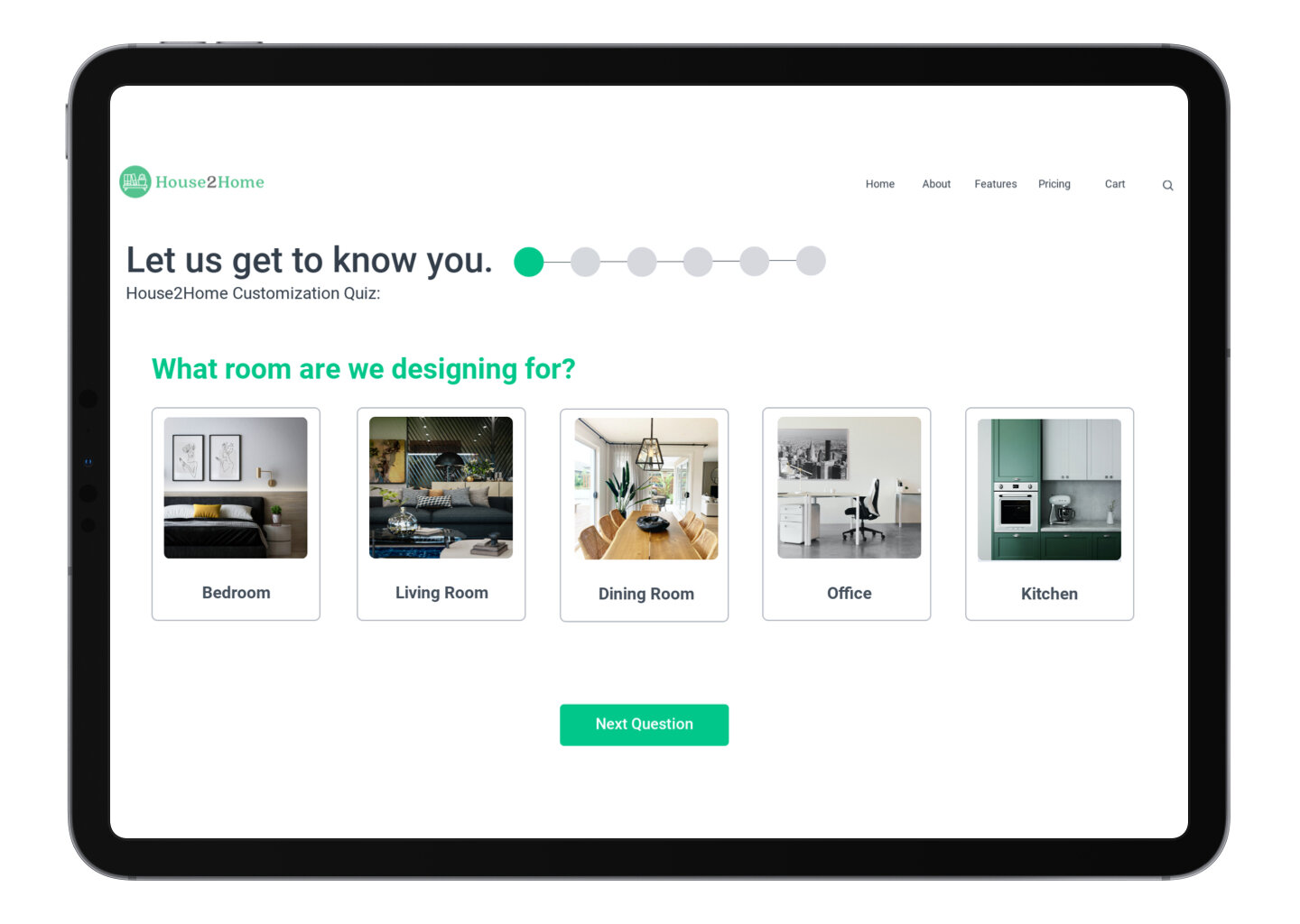
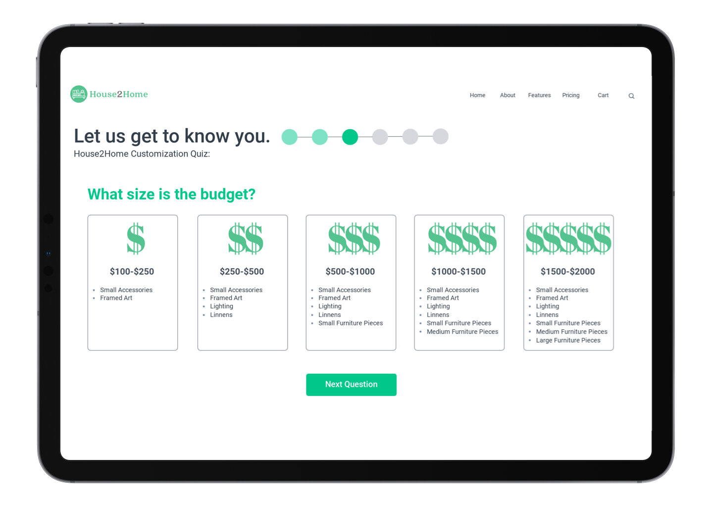
Next are some examples of the questions asked within the survey. Some questions allow for multiple answers to collect as much intel as possible. Others are very concise to meet users expectations. For example, budget being a huge concern, users will have an understanding of how much their packages will cost based on their selected answer. Meanwhile, users can select more than one choice for items they want within their design. To help the quiz be entertaining to complete, I provided different question formats, along with several visual stimulations.
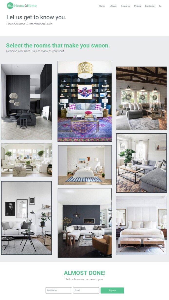
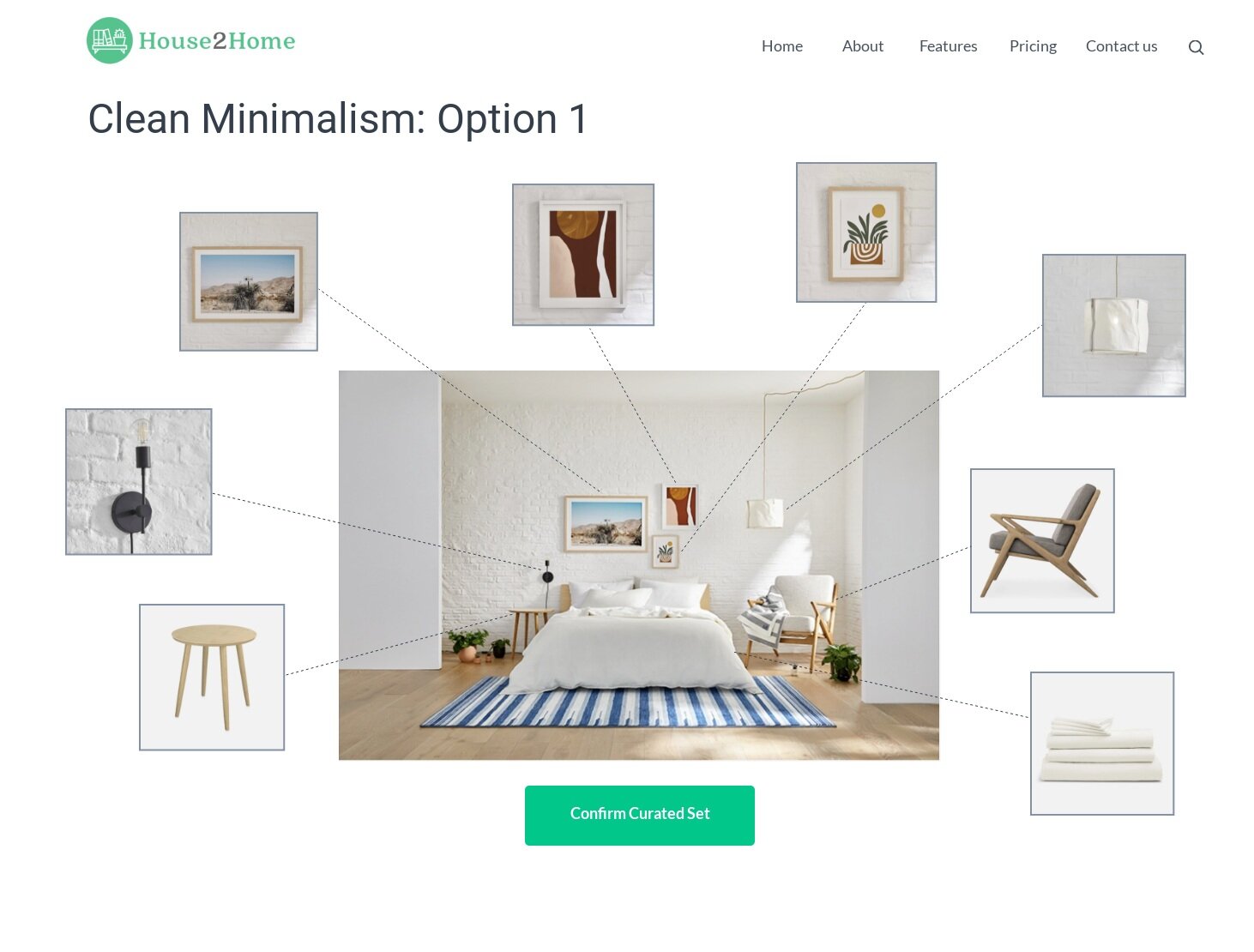
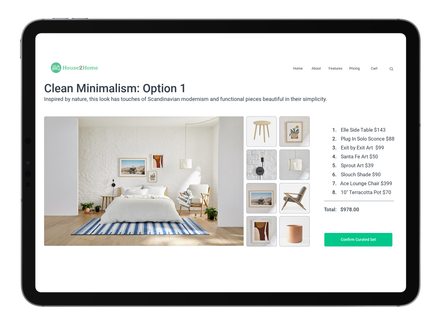
Finally users are given their results with a visual and written explanation. They then have the ability to explore within 2 packages
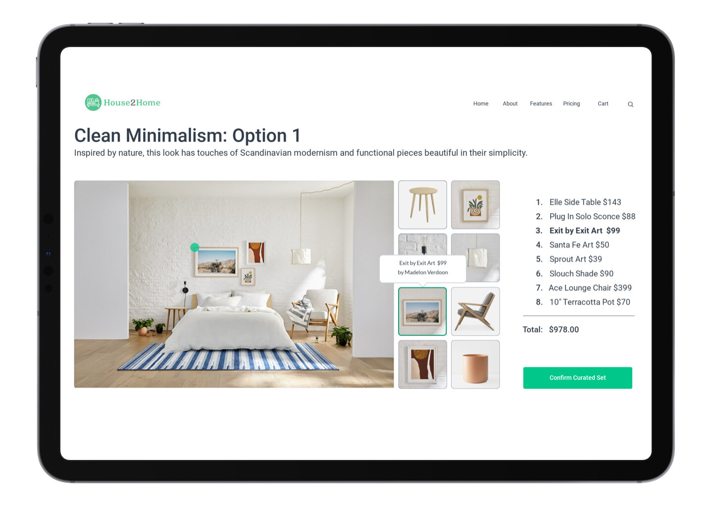
When enlarging a package, the image gets broken down into each item being offered within the package. Users can hover over, and then further click into each item to see more information. They also have the option to swap out items if they are not excited about a certain accessory.



Day 5- Validate
I interviewed 5 people aged 16-65, who are interested in decor, have experience moving into brand new homes within the last 2 years, and purchase items online.
All of the test subjects found the quiz easy and informative. In general the collective bunch wanted more of a description of what is included within each budget range. A more consistent format was also suggested.
Findings
When it came to the results, I began clustering user testimonials through affinity mapping. I found out that users wanted:
To be able to see how much each item cost throughout the results.
They needed more information to understand that all of the images on the results page were included within the package.
More details per item visible while hovering over images within the results pages.
More consistent formatting throughout the questionnaire, and answer selections need to be simpler.
Day 5- Prototype: Final Iteration
The appropriate changes from prior user testing can be seen in the final iteration fo the prototype.

Reflections
I was excited to help customers be able to decorate their home. Personally, this was a full circle moment for me, combining both of my design passions; interiors and UX/ UI.My favorite challenge from the House 2 Home design sprint was finding a way to help users visualize how decor accessories can be cohesive.
If time was not a factor, I would have wanted to further explore the main image presented to users that shows all the chosen accessories collectively. I started exploring this with the green indicator that hovers over certain areas in the main image as you move across the page, but I think there is a lot of potential here to make this visual correlation easier for users. Perhaps the swapped accessories visibly change in the cohesive image, or some sort of magnification occurs to highlight the area instead of a green dot.
I had a great time with this project from beginning to end and I hope you felt the same when reviewing my case study. Leave any feedback or suggestions if there’s anything you think I can improve on. I would love to discuss it in the comments. Thank you for reading!


